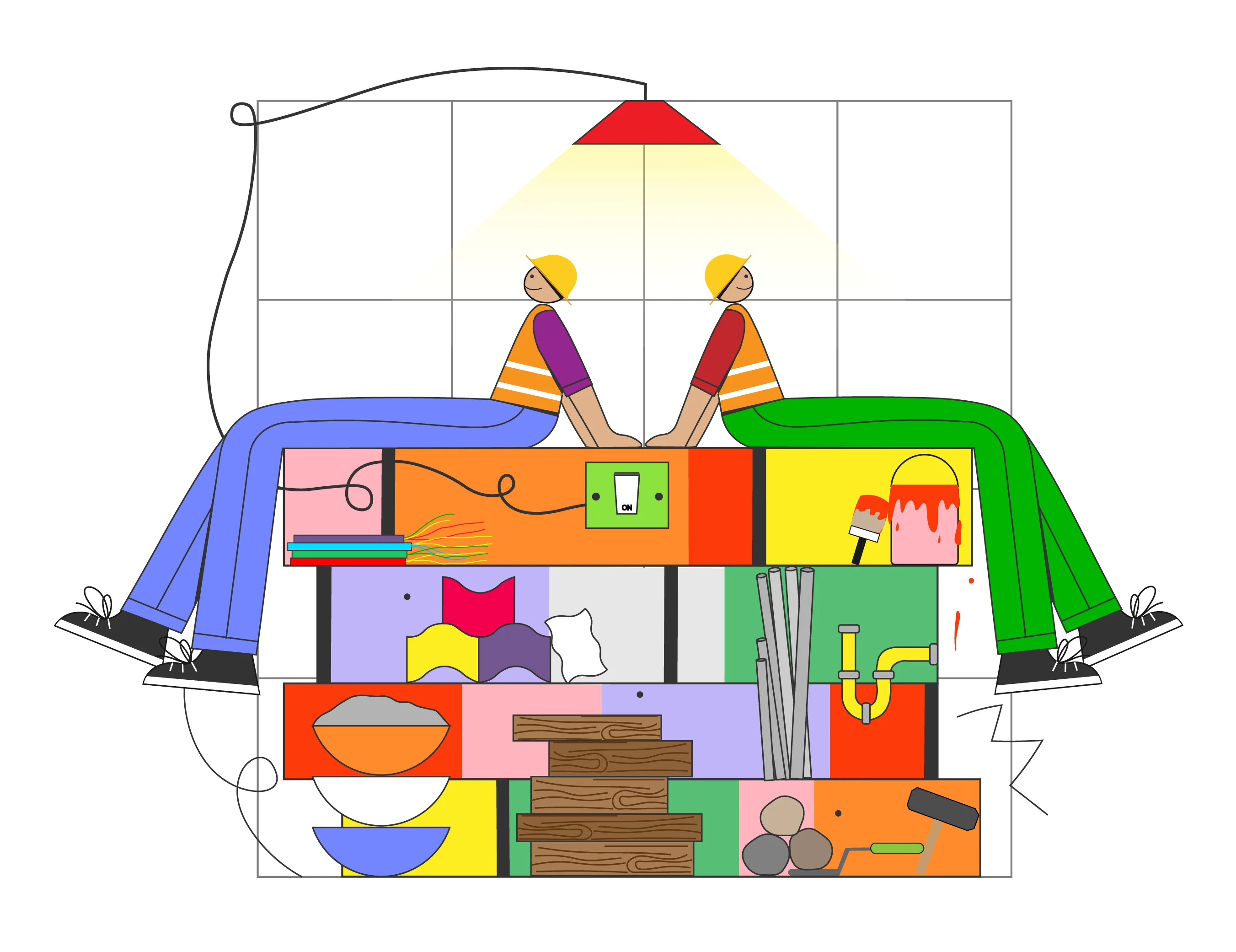
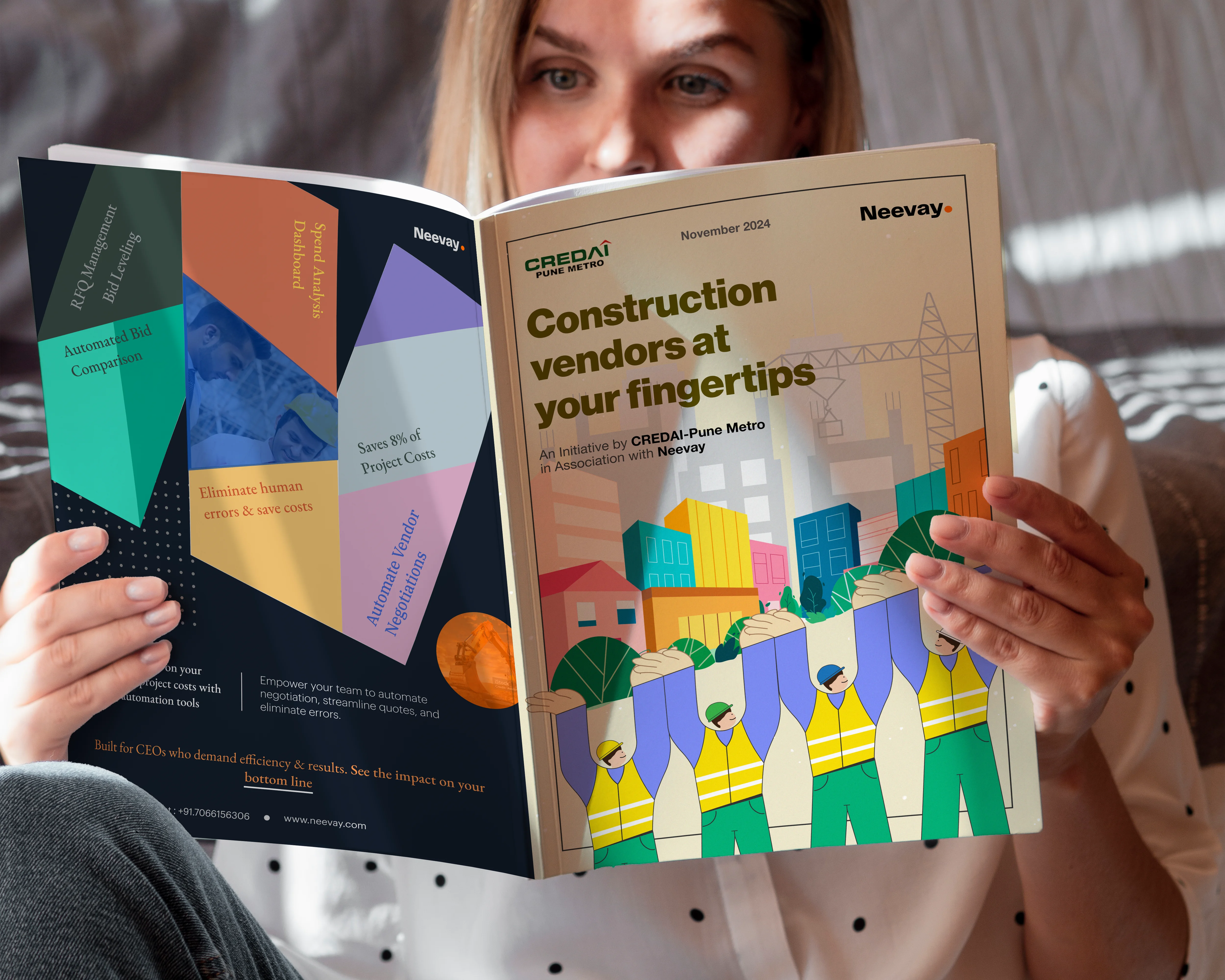
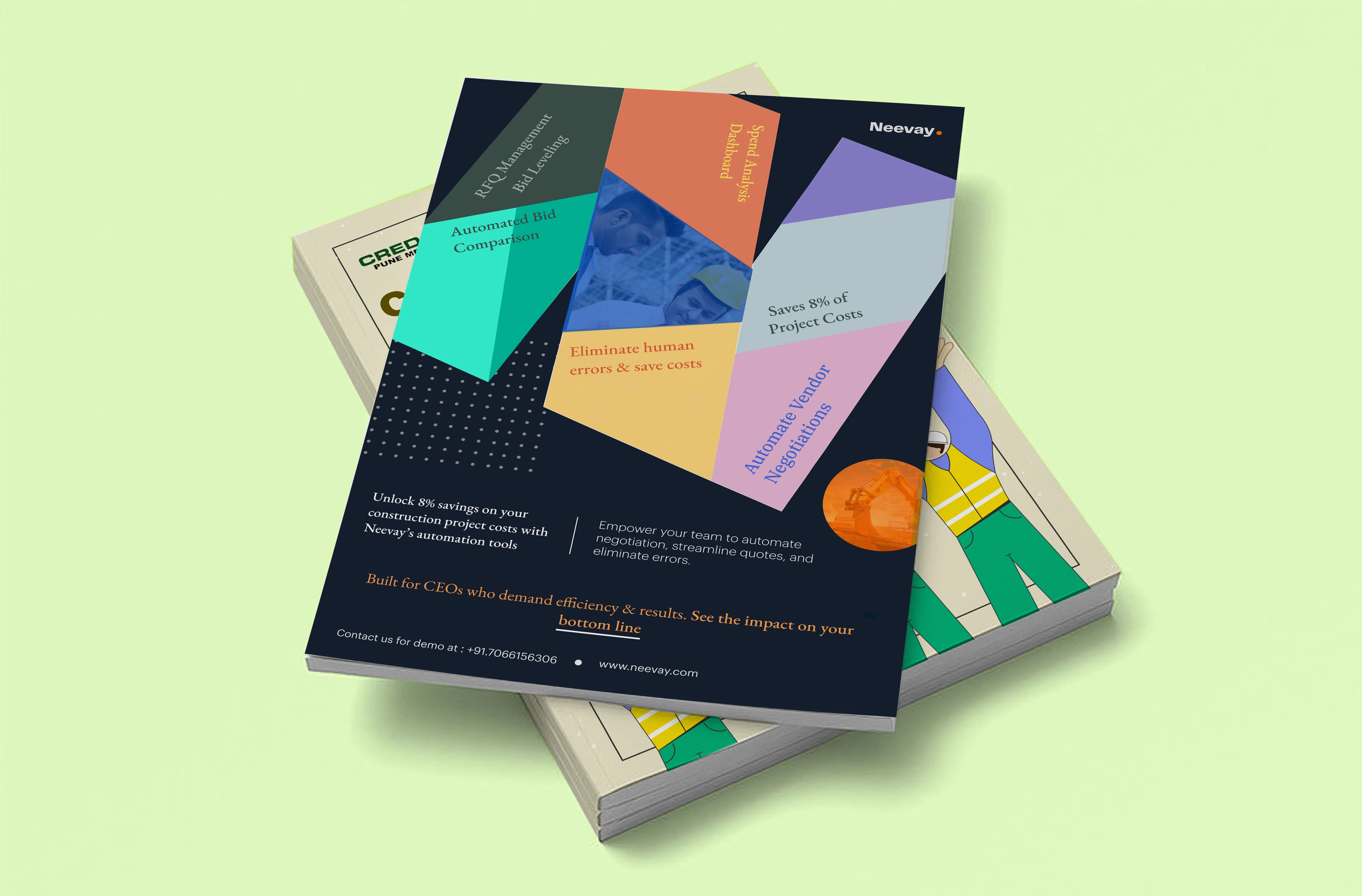
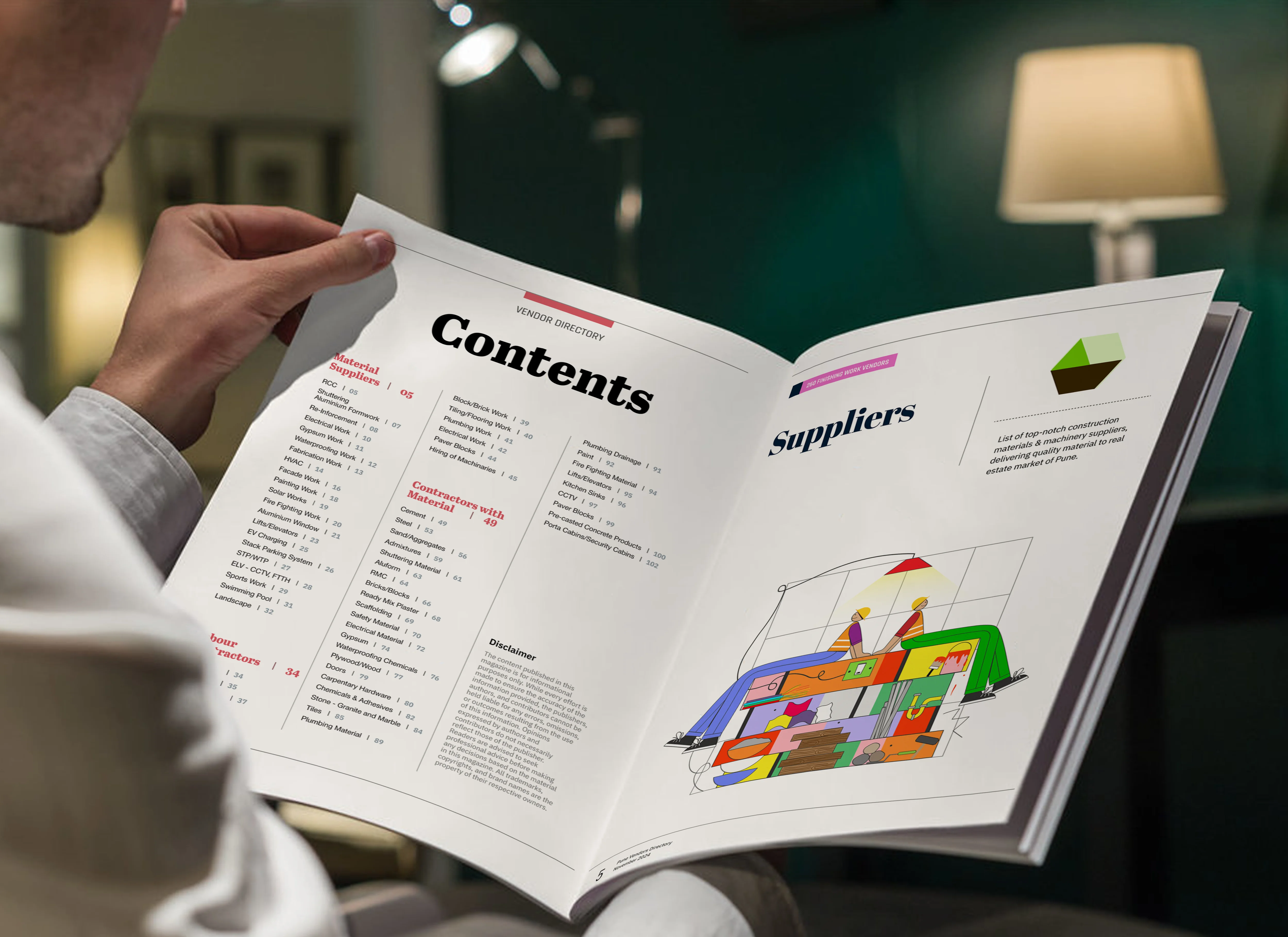
CREDAI-Pune Metro partnered with Neevay to create a new, modern Vendor Contact Directory. This directory is designed to help businesses quickly find and connect with trusted vendors across different industries—like construction, materials, services, and more. I was brought in to create unique illustrations for each category, including a bold cover page, worker-themed visuals, and material-specific designs. These visuals helped break up the content and gave each section its own personality, making the entire magazine more user-friendly and visually engaging.
One of the main challenges was that vendor directories are often seen as dry or boring, filled with plain lists and contact info. Our goal was to make this publication feel fresh, modern, and easy to navigate, without losing the professional tone it needed. We also had to make sure that each category stood out while still feeling like part of the same brand family.

To bring the magazine to life, we decided to use a whimsical and friendly illustration style - one that would make the content feel more human and less corporate. I created hand-drawn illustrations that matched each section’s theme, such as construction workers, tools, and building materials. We used bright colours geometrical shapes and playful details to make the artwork energetic and approachable.
Throughout the process, I collaborated closely with our art director to make sure each visual matched the purpose of its section and fit well with the magazine’s structure.
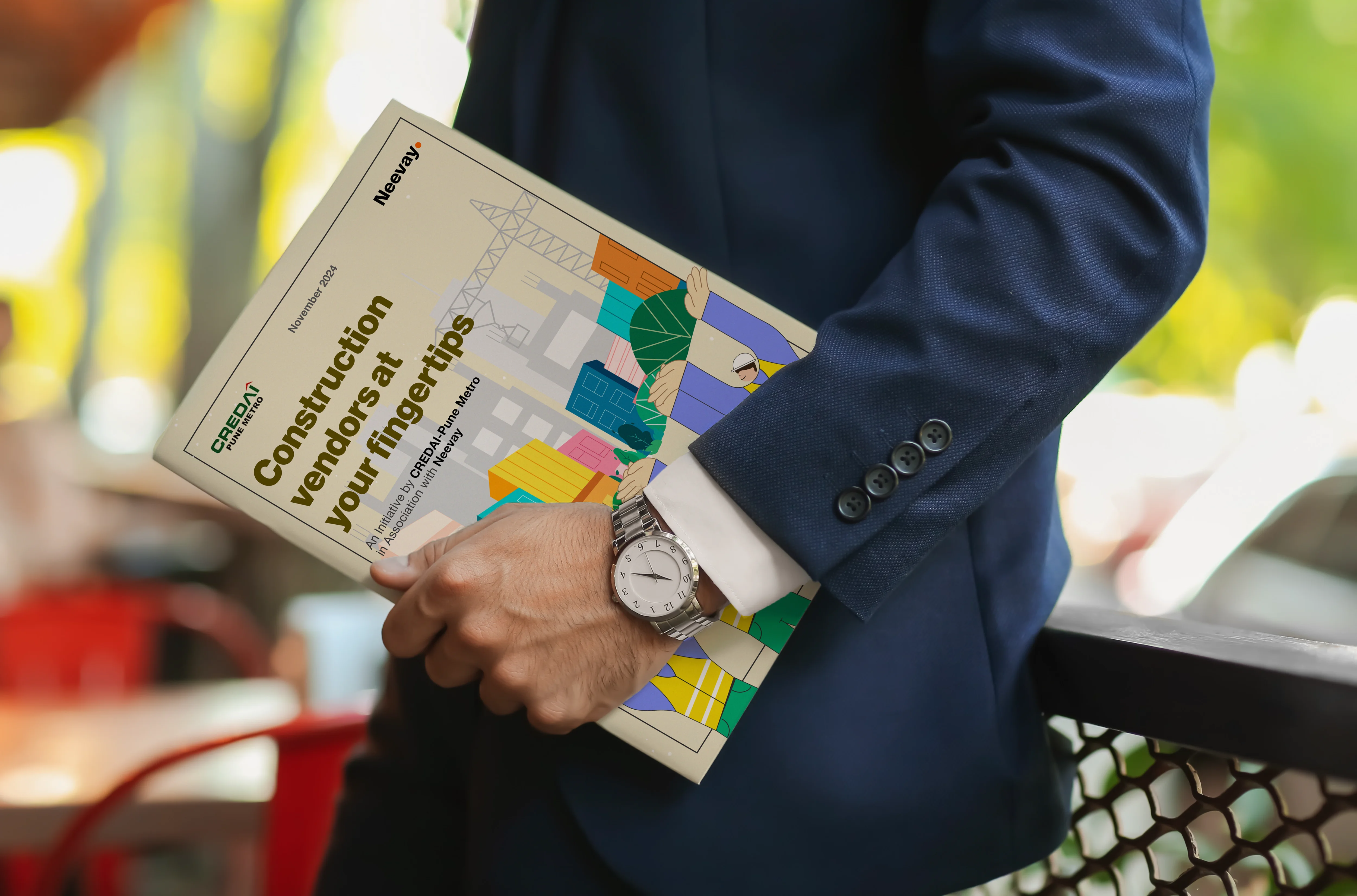
The final result was a vibrant, easy-to-use magazine that looked and felt completely different from a typical vendor listing. The illustrations added charm and character, helping users quickly recognise sections and feel more connected to the content.
The magazine now works as a helpful tool for networking and discovery—shaped with care to make information feel clear, engaging, and easy to explore.
The tone of the project was designed to be professional yet charming. While the information needed to be clear and trustworthy, the visuals brought a fresh, more human feel. The overall tone speaks to people from all walks of the real estate industry—developers, vendors, builders—with a mix of creativity and clarity that makes the directory enjoyable to use.

The project was beautifully shaped under the art direction of Mayur Maheshwari, whose creative guidance was key in setting the tone and visual language. Mayur encouraged an illustration style that felt dynamic, and full of personality, while still being useful and easy to understand. His thoughtful direction helped ensure that each illustration felt consistent, meaningful, and aligned with the magazine’s purpose.