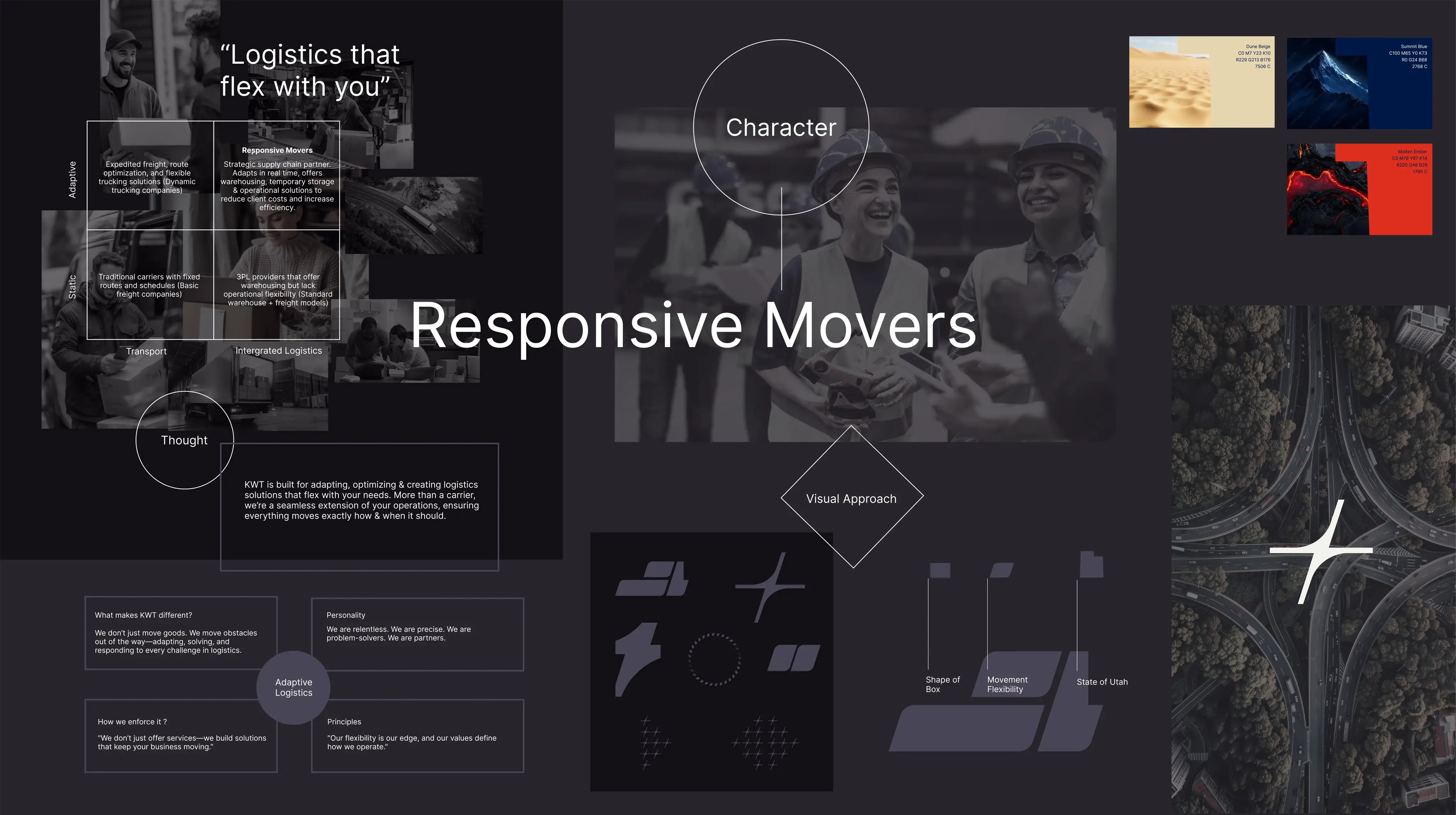
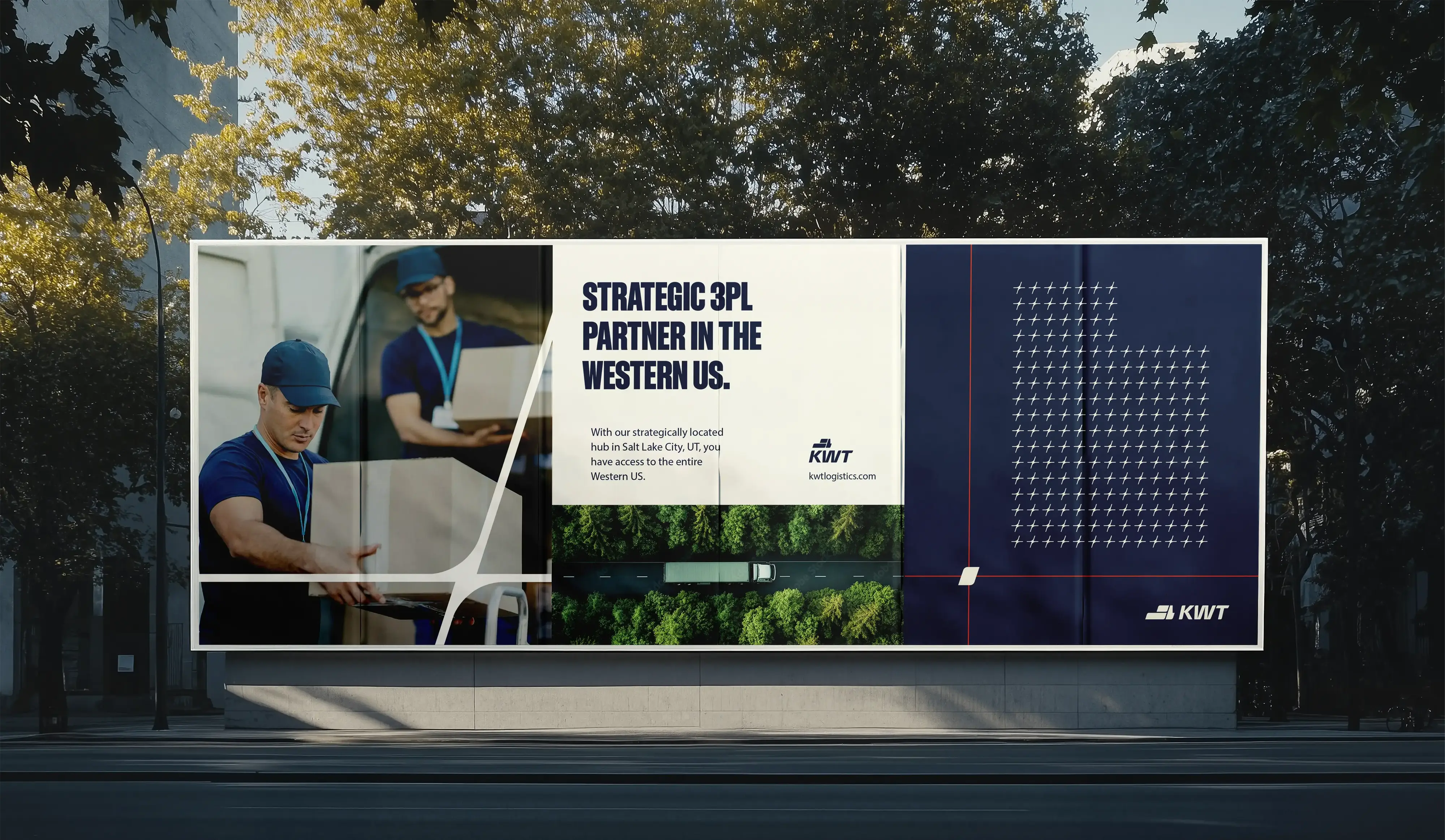
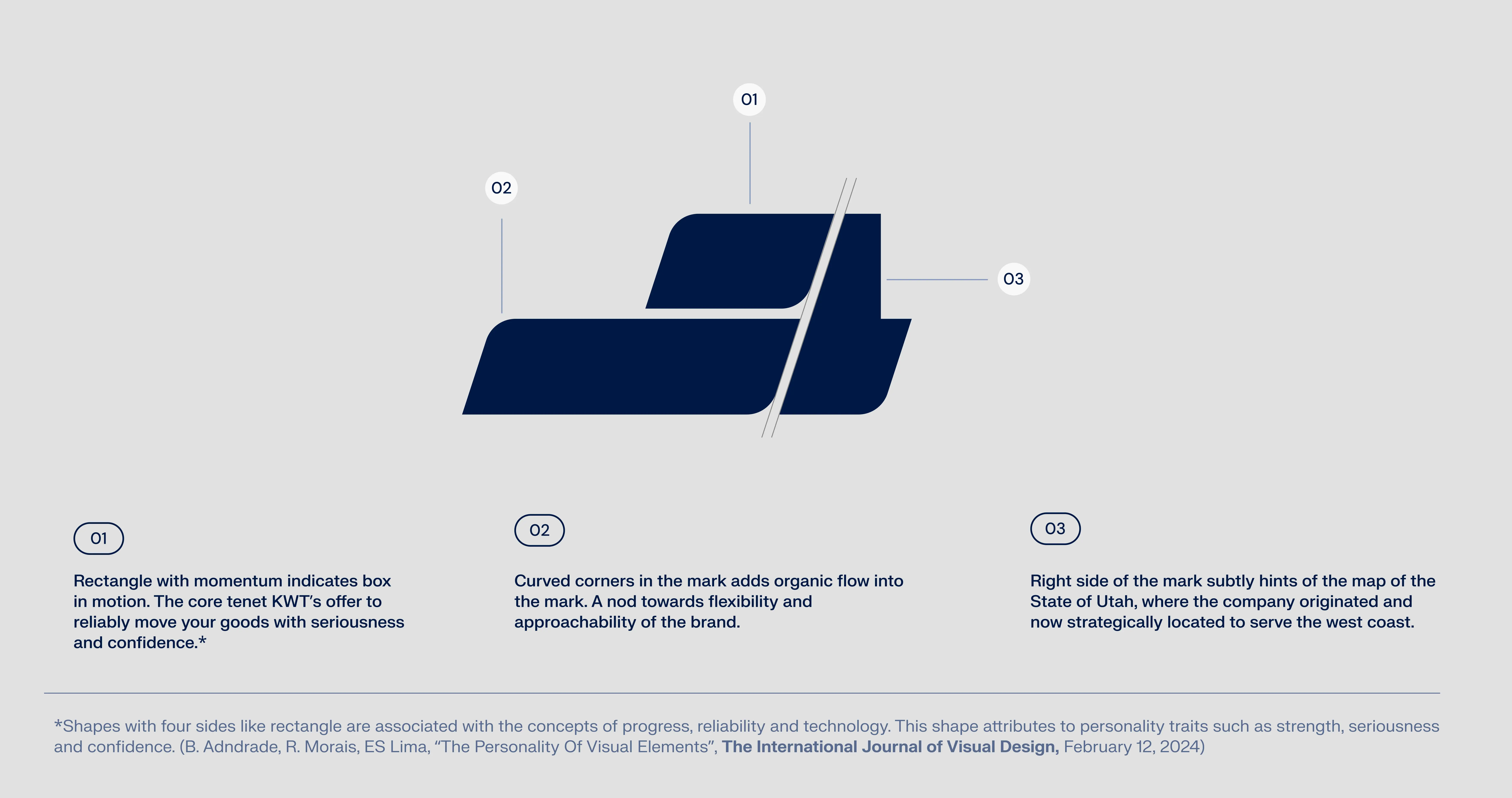
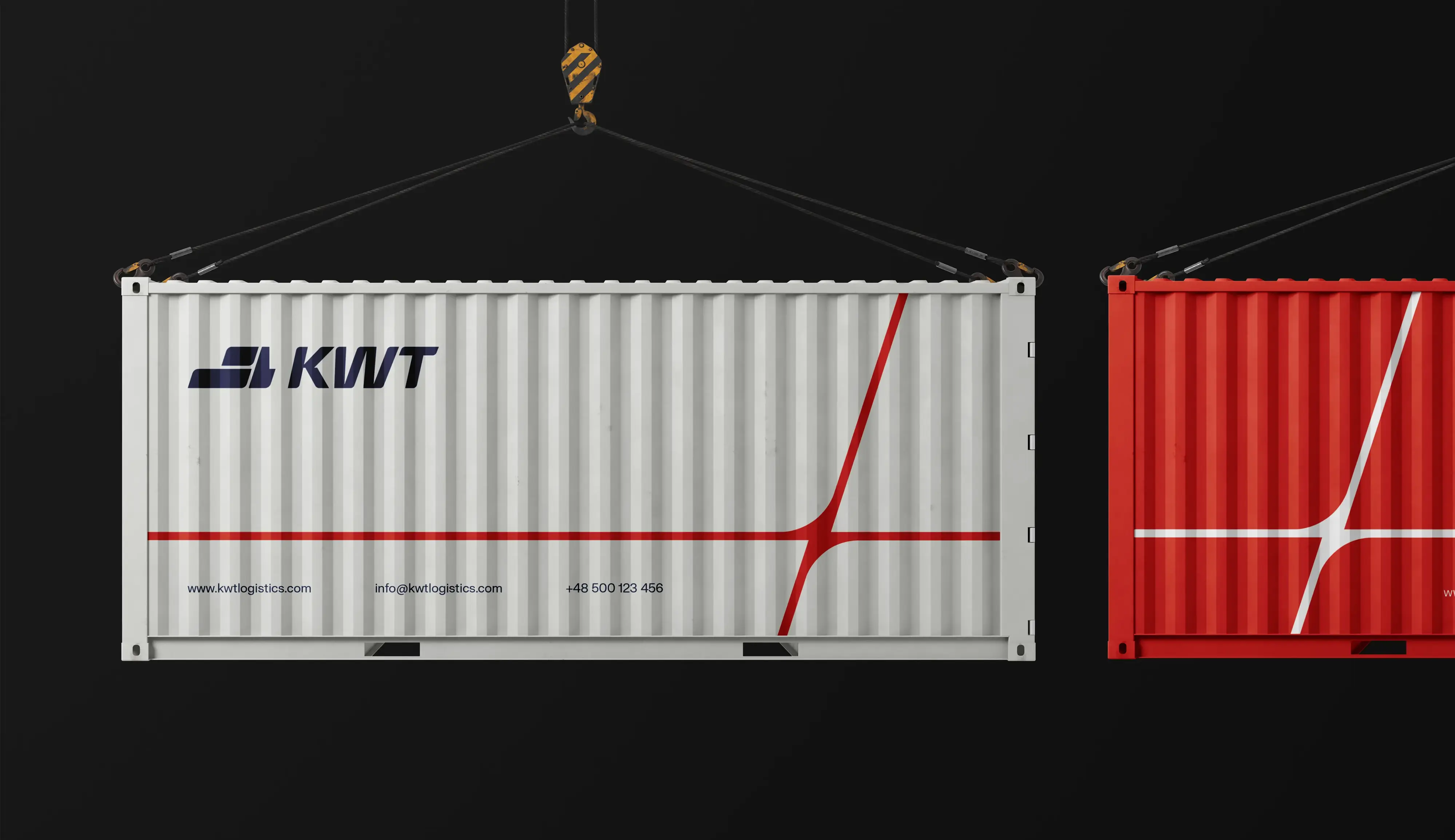
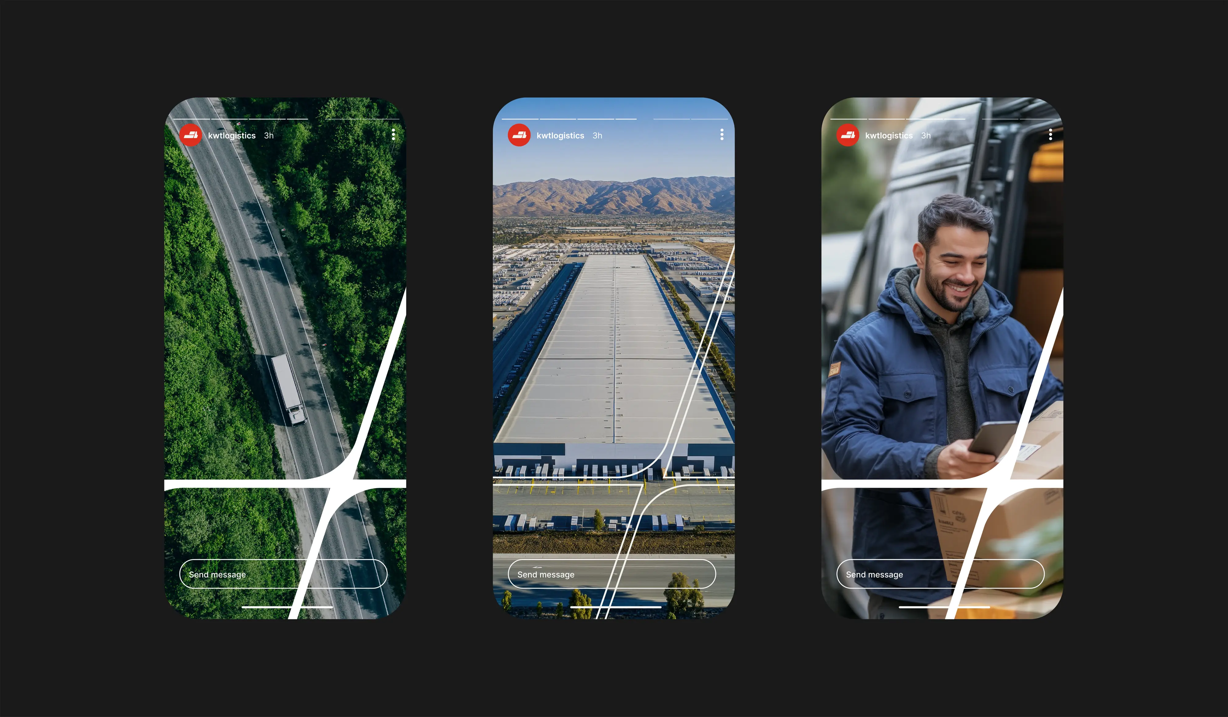
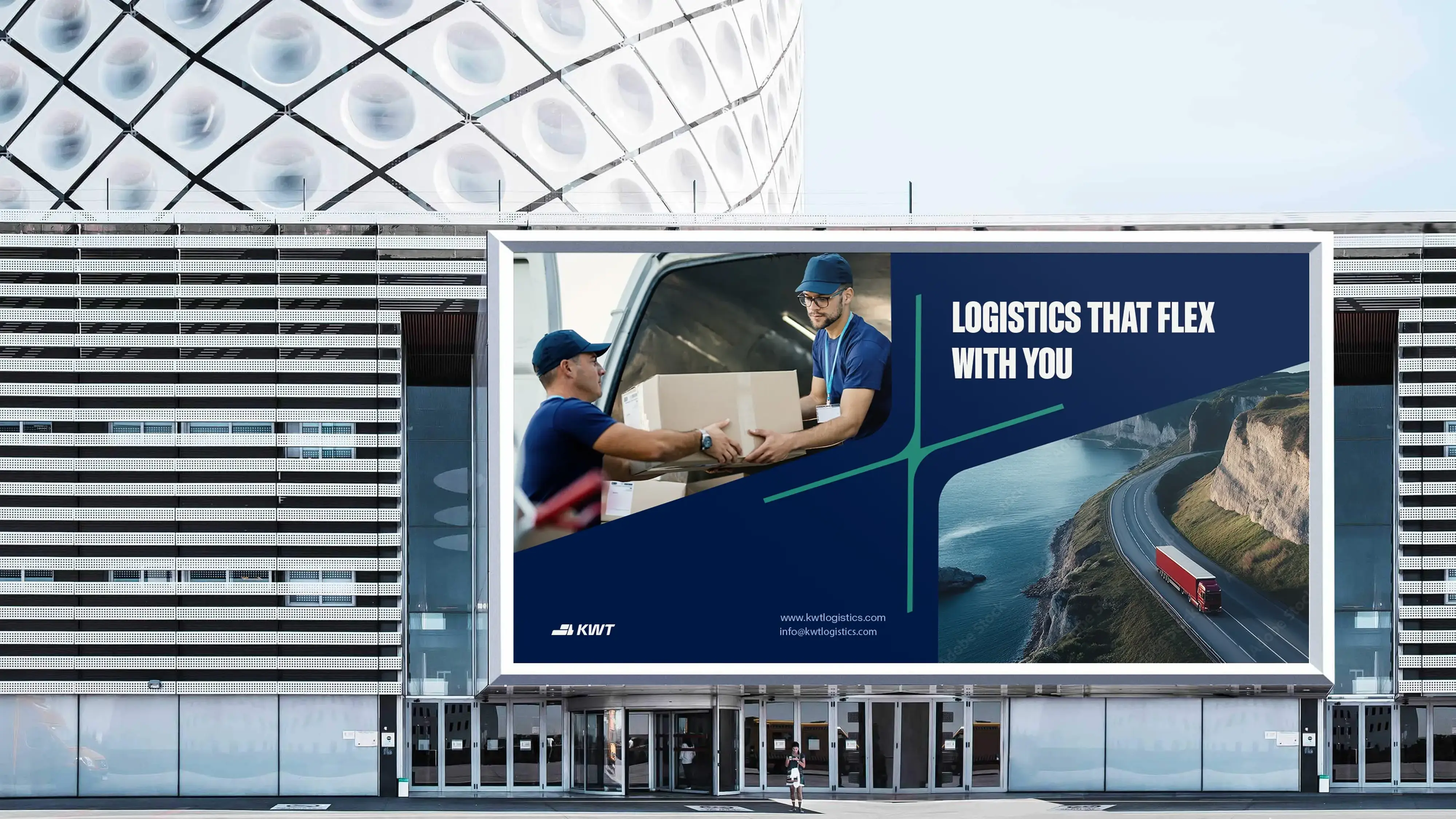
The Flex is KWT Logistics’ core brand expression, rooted in the strategic geography of Salt Lake City, where two of America’s most vital freeways, I-15 and I-80, intersect. These freeways connect the country from Canada to Mexico and coast to coast, forming a powerful logistics backbone. From this infrastructure, we drew a graphic element that began as a simple moving box from the logo.
Over time, it evolved into The Flex: a dynamic, standalone mark echoing the geometry of a freeway interchange. As it stretched and adapted, it revealed a deeper metaphor, movement, agility, and presence. The Flex is more than a shape, it’s the visual embodiment of KWT’s adaptability and dominance in the Western U.S. logistics market.