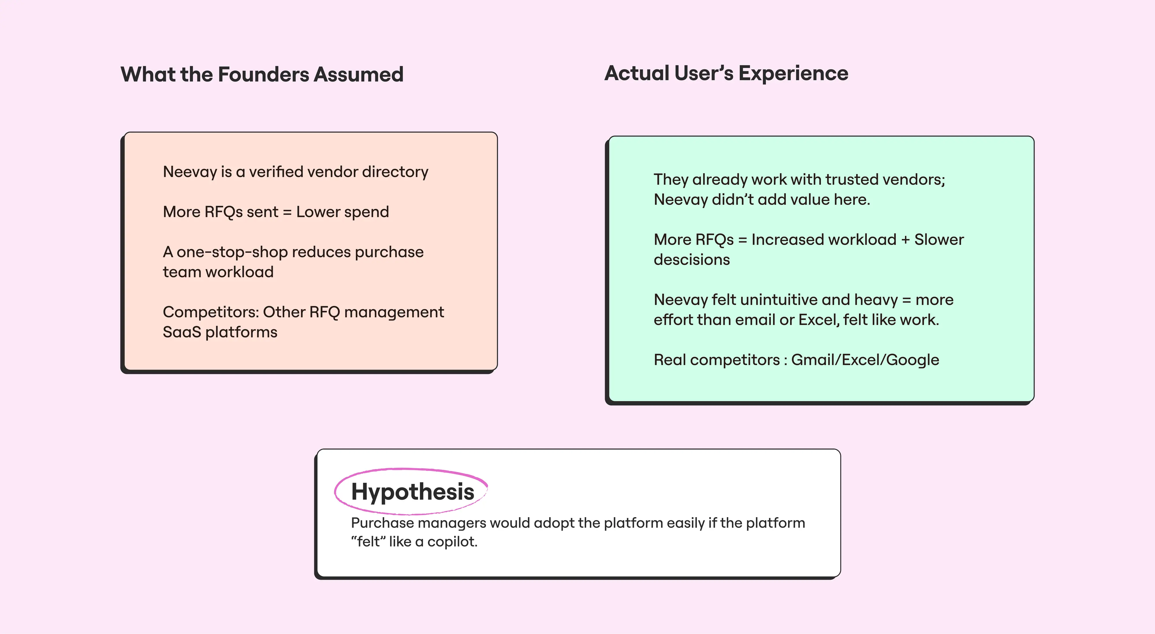
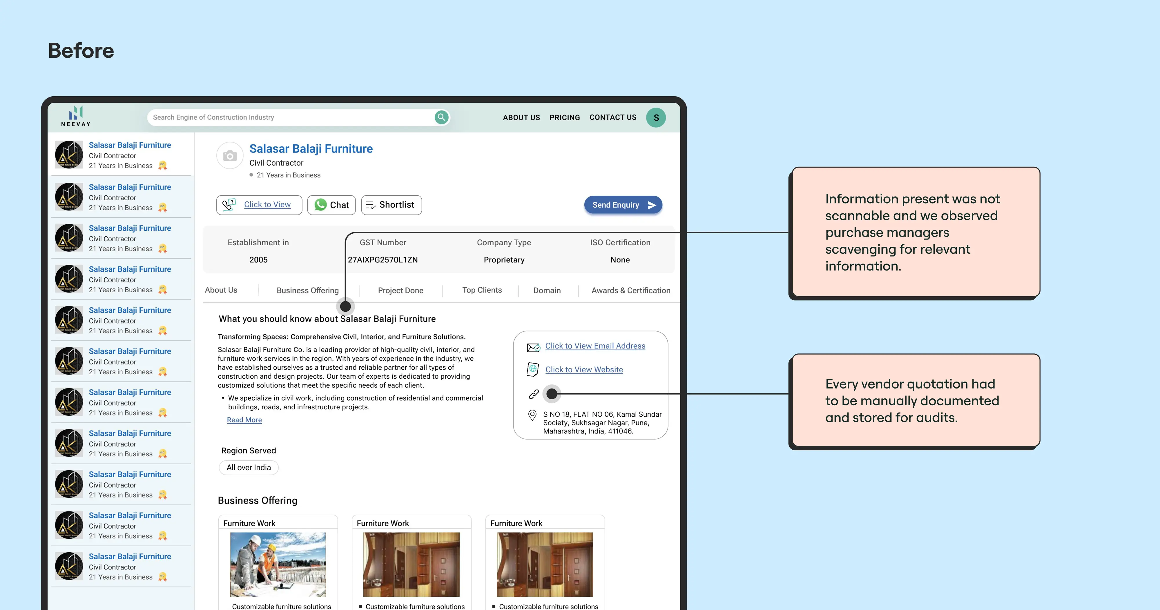
We grounded the redesign in Stephen Anderson’s
UX Hierarchy of Needs—starting with usability and convenience, and gradually moving toward pleasure and meaning. The goal wasn’t to just make things look better but to make the app feel like a tool purchase managers could rely on every day.
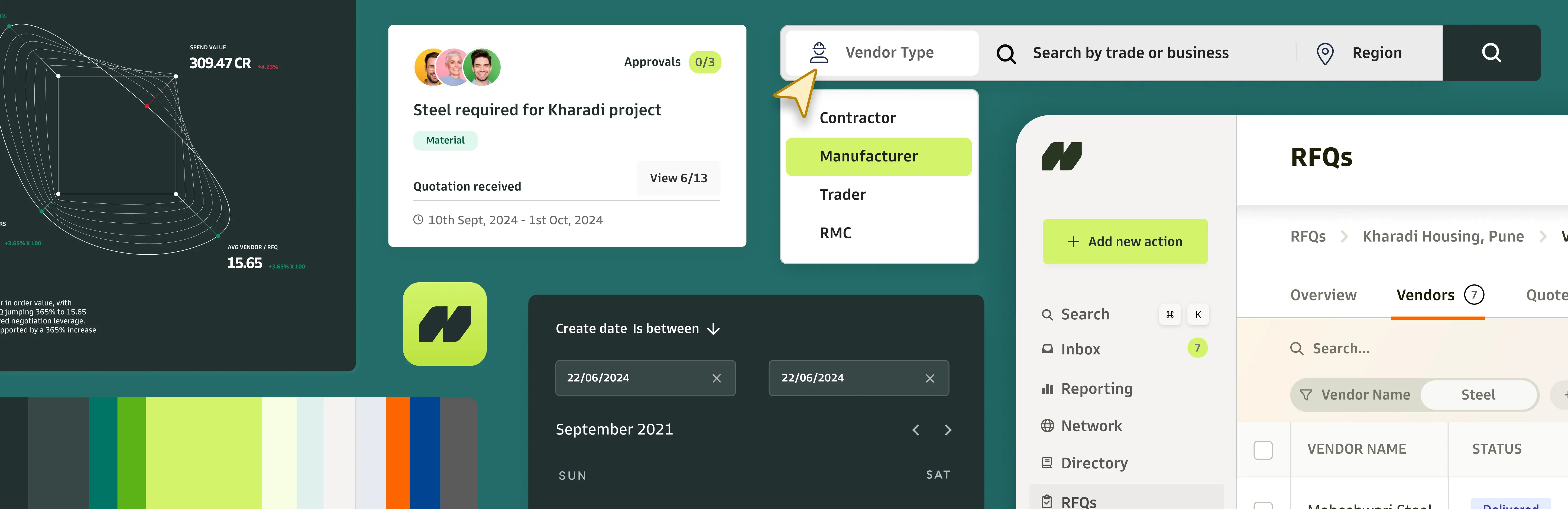
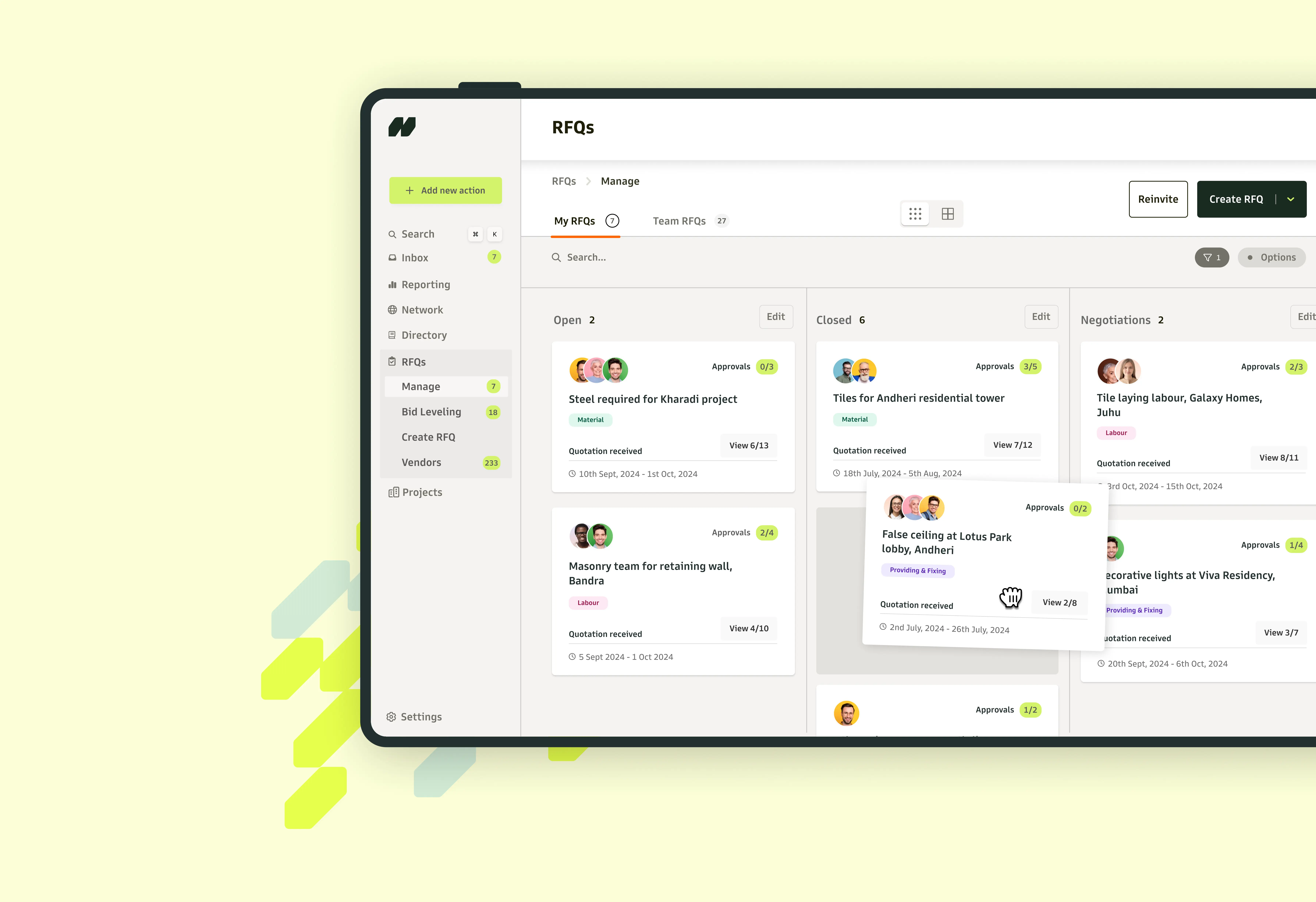
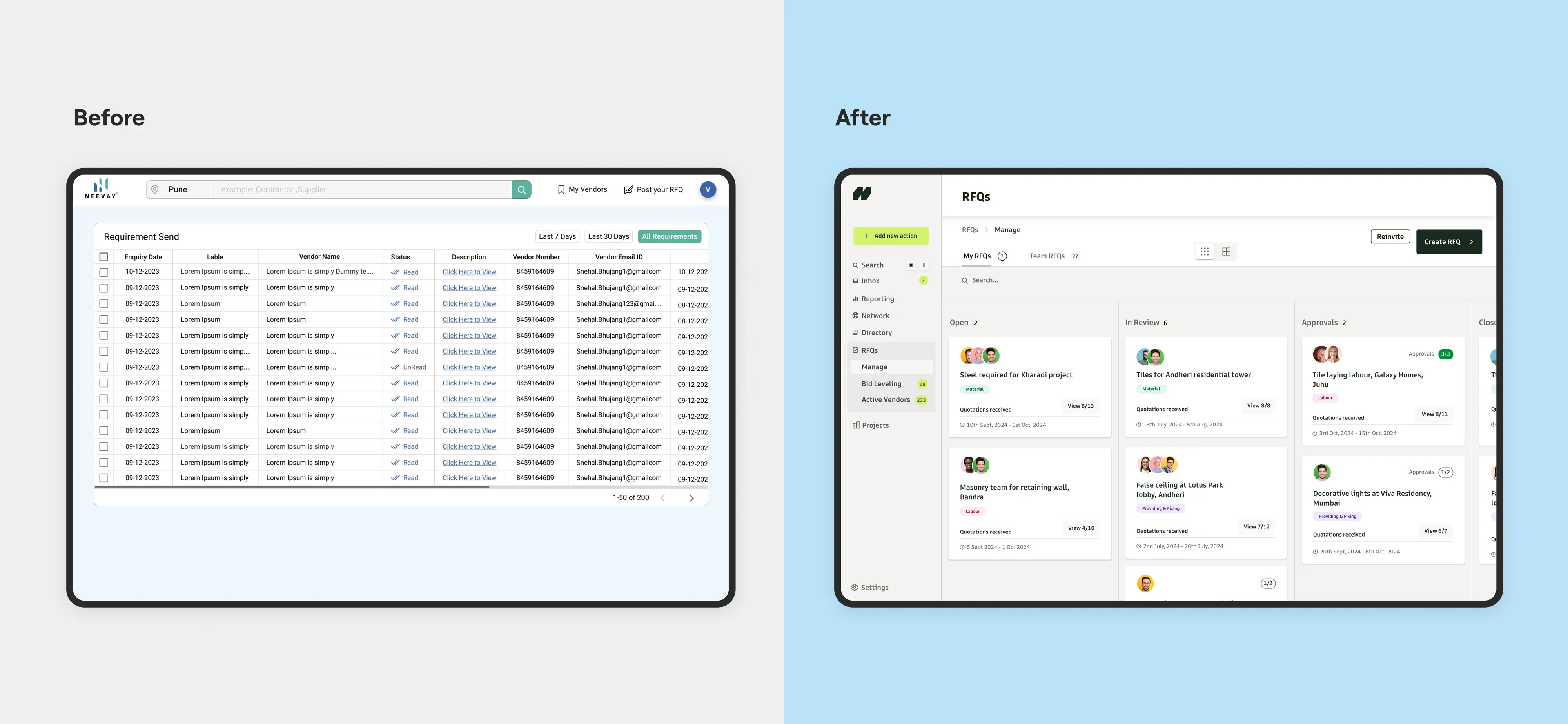
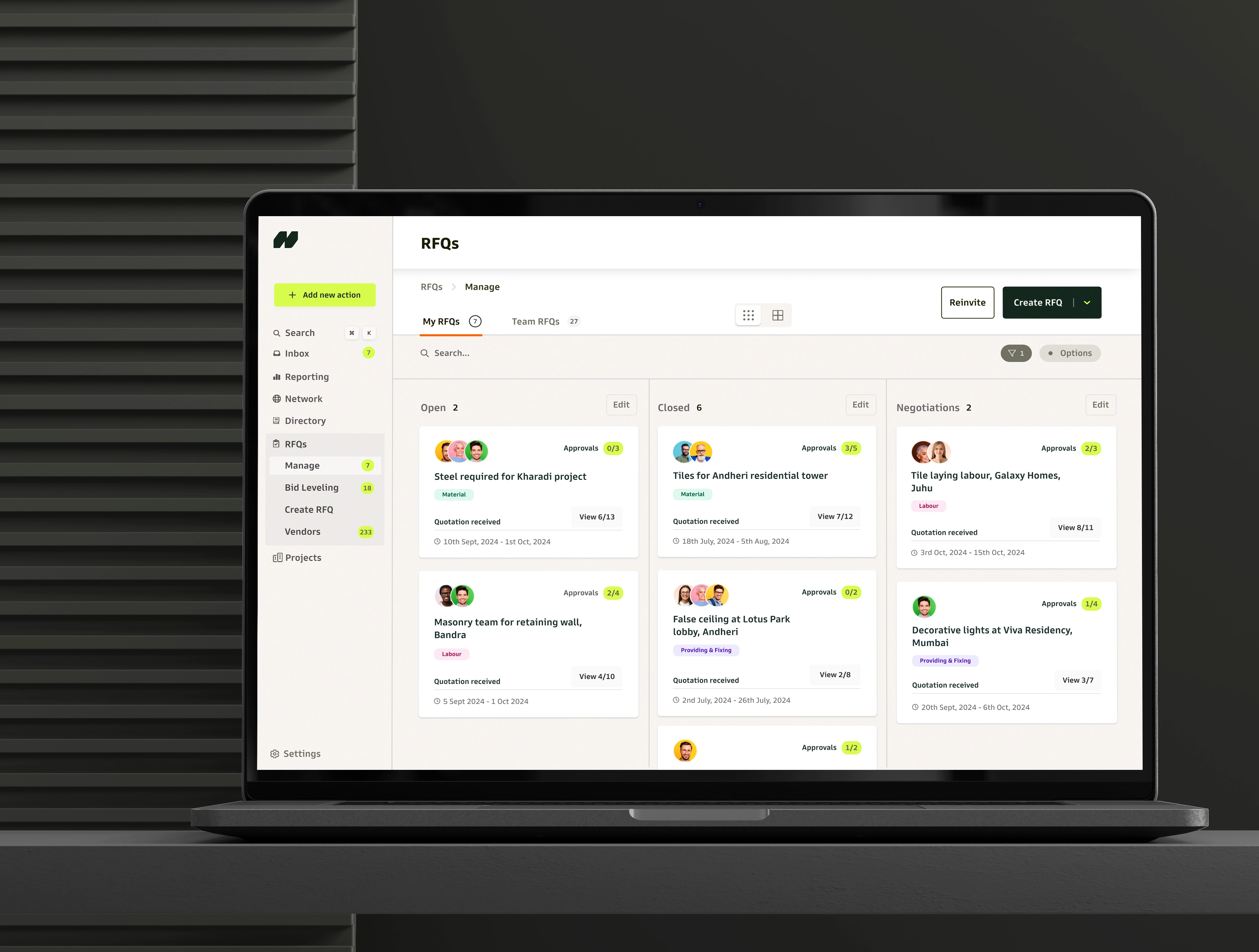
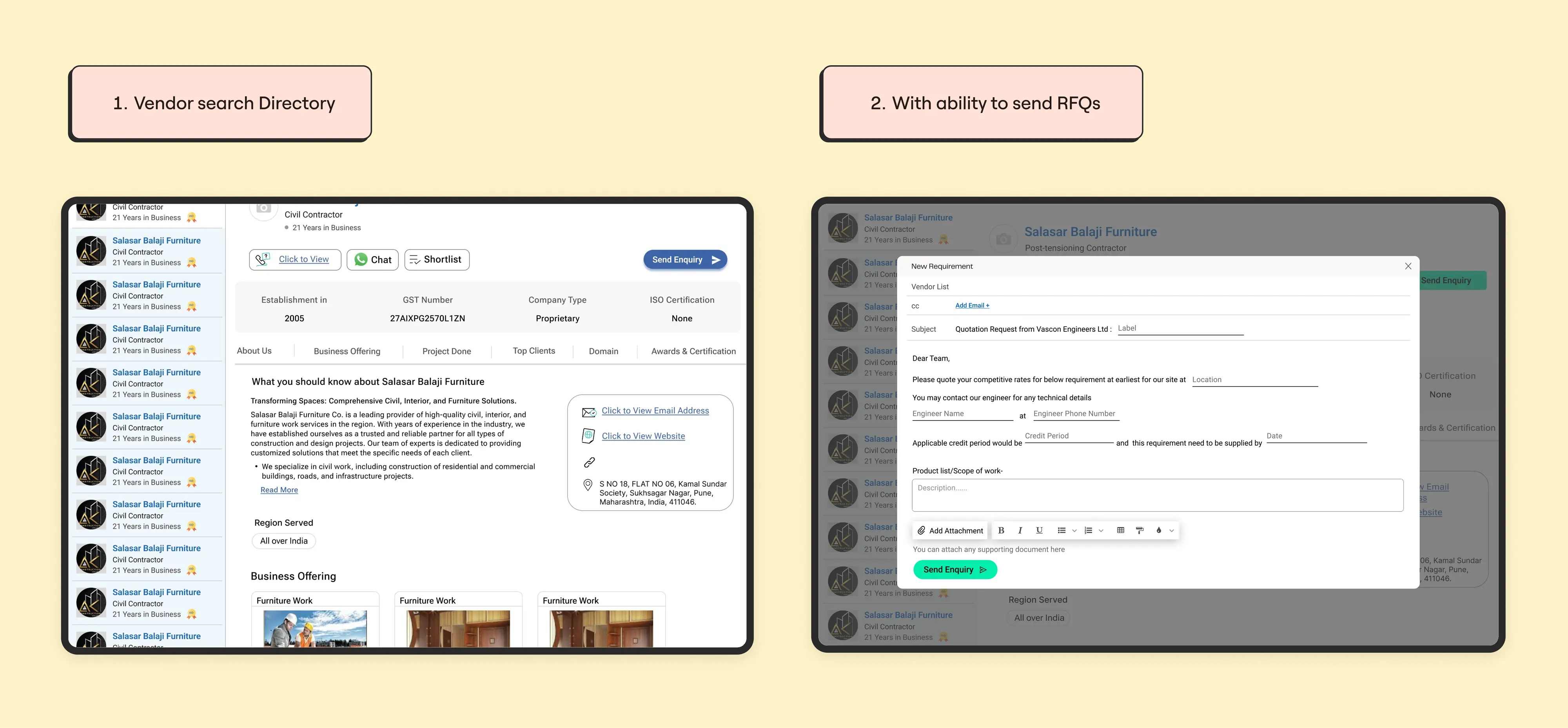
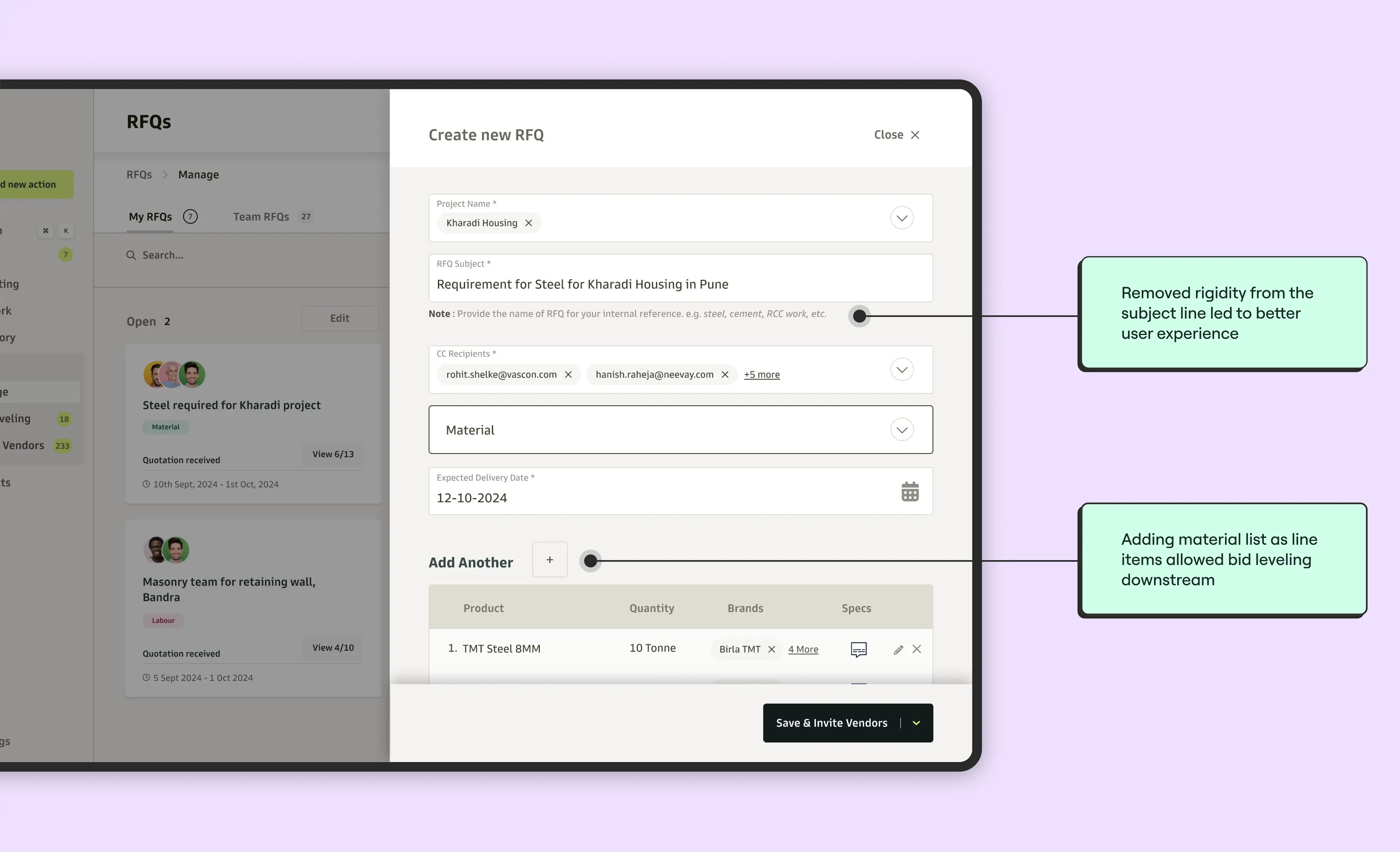
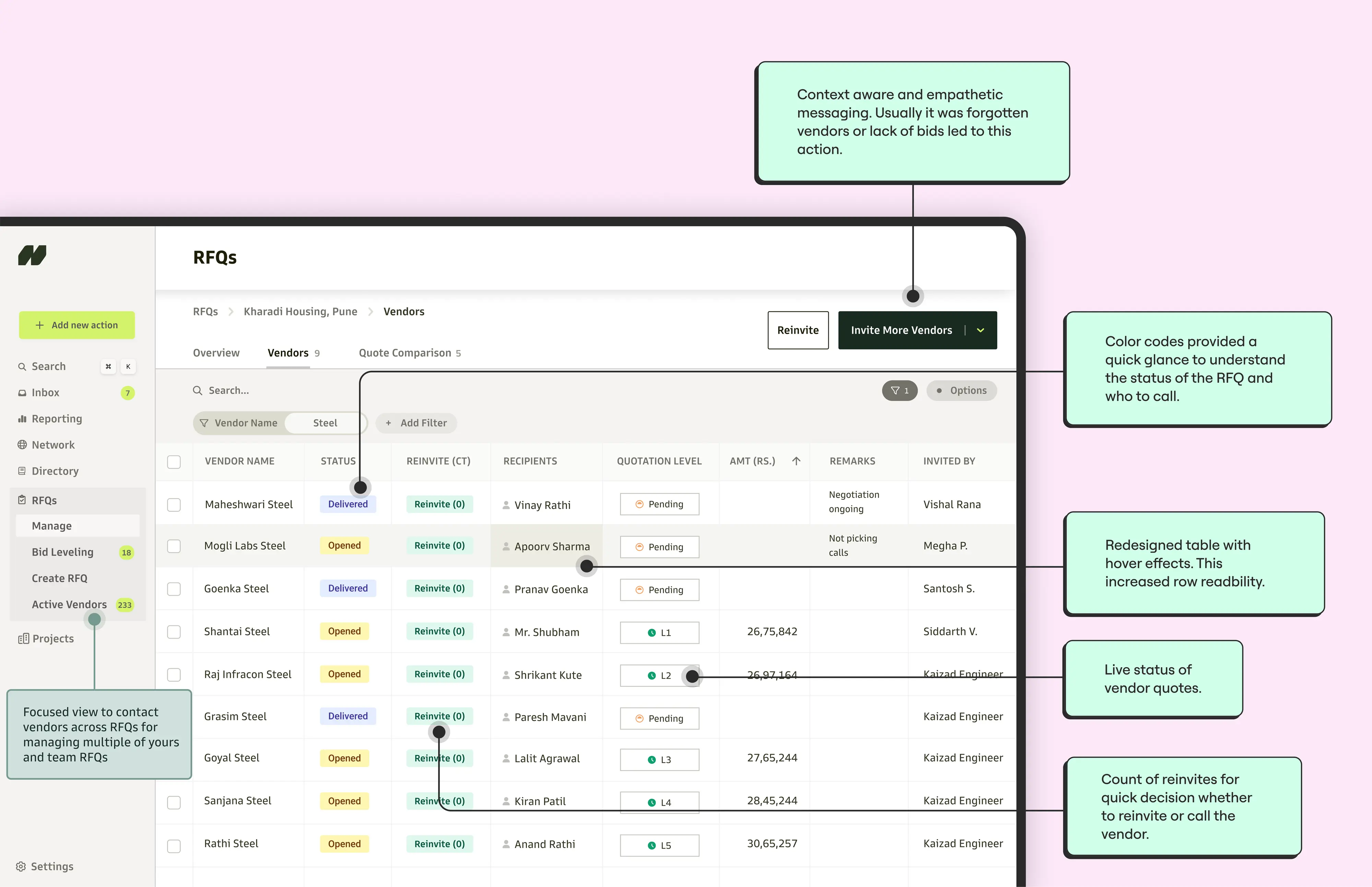
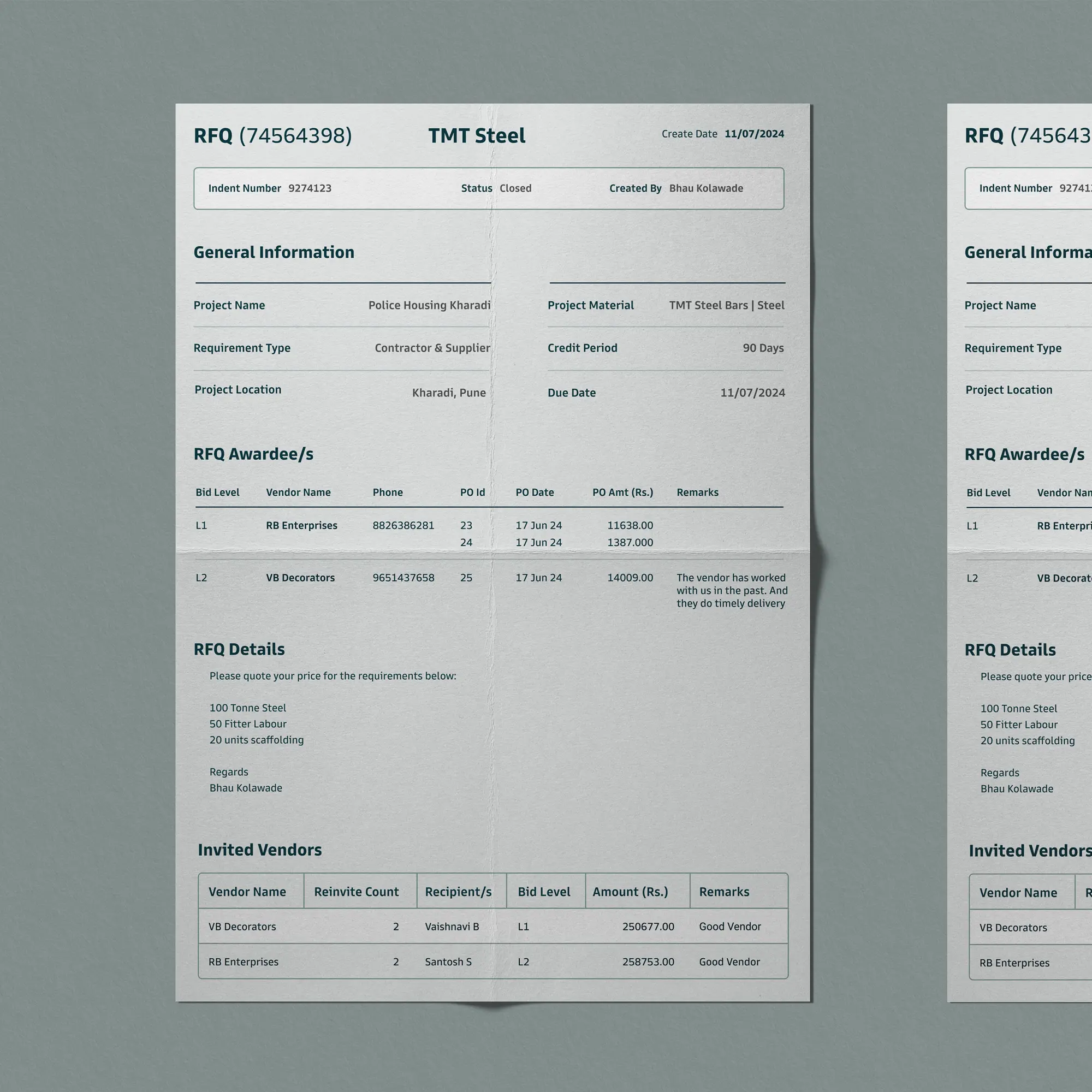
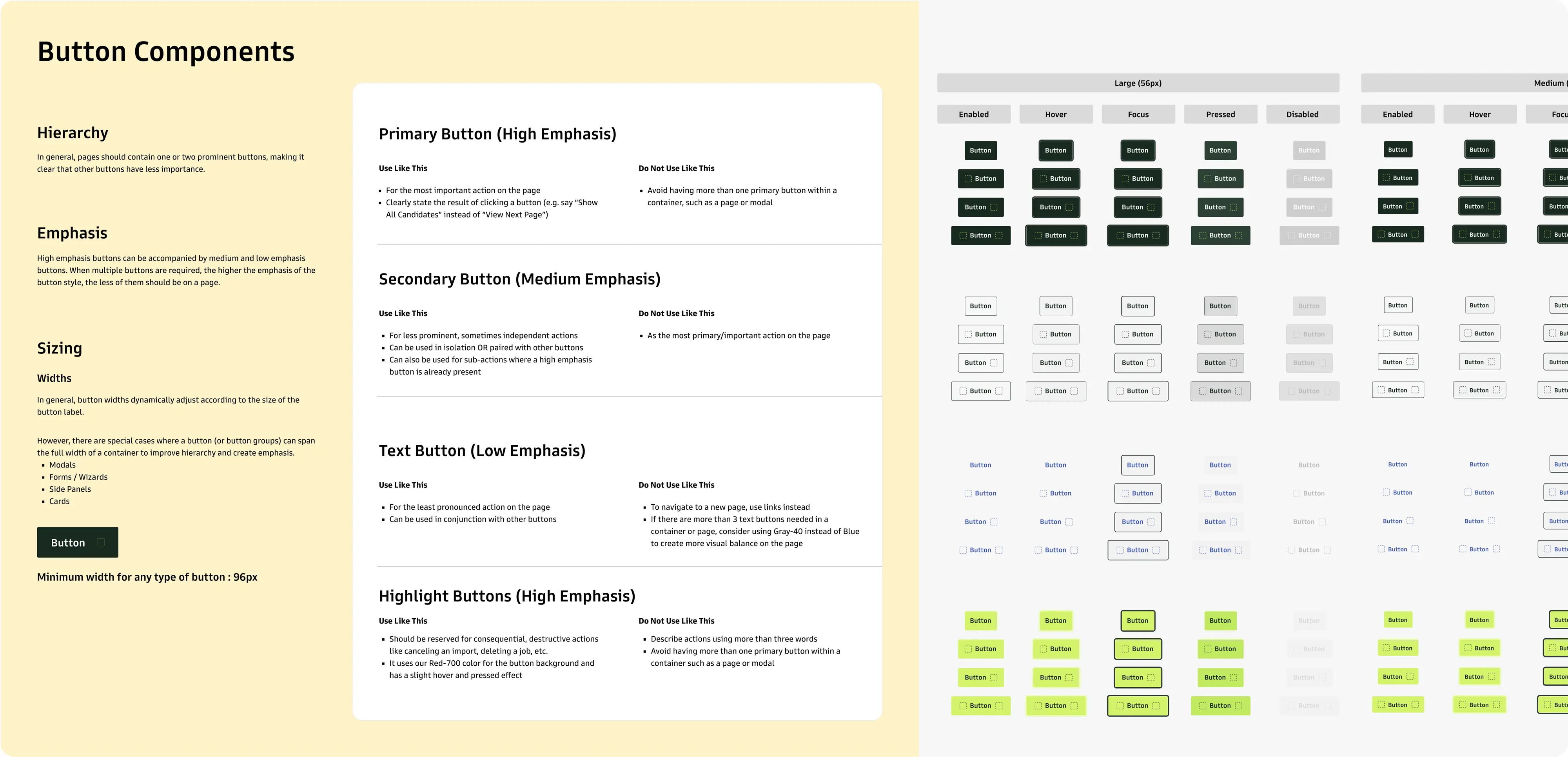
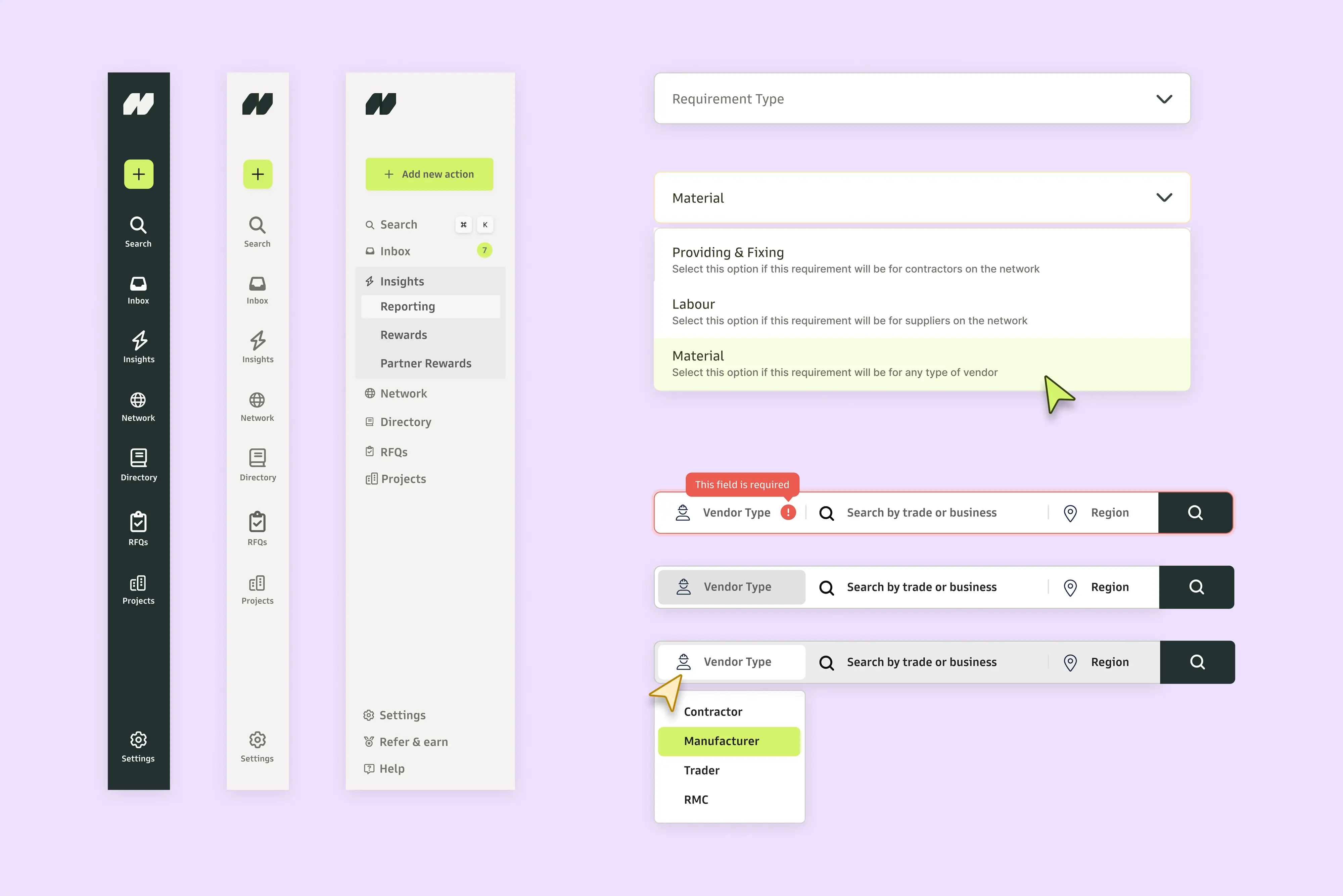
The first step: overhaul the RFQ creation flow.
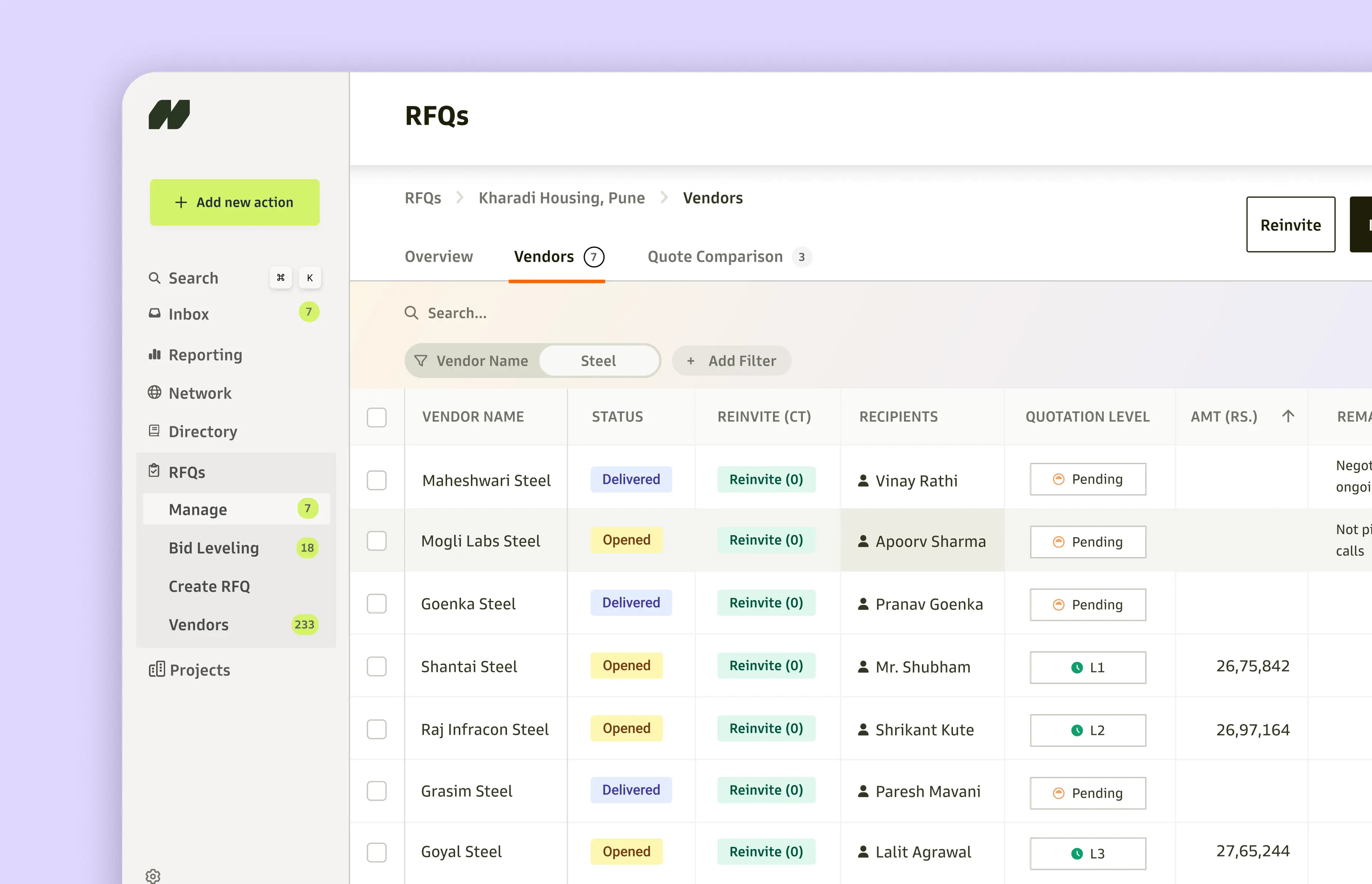
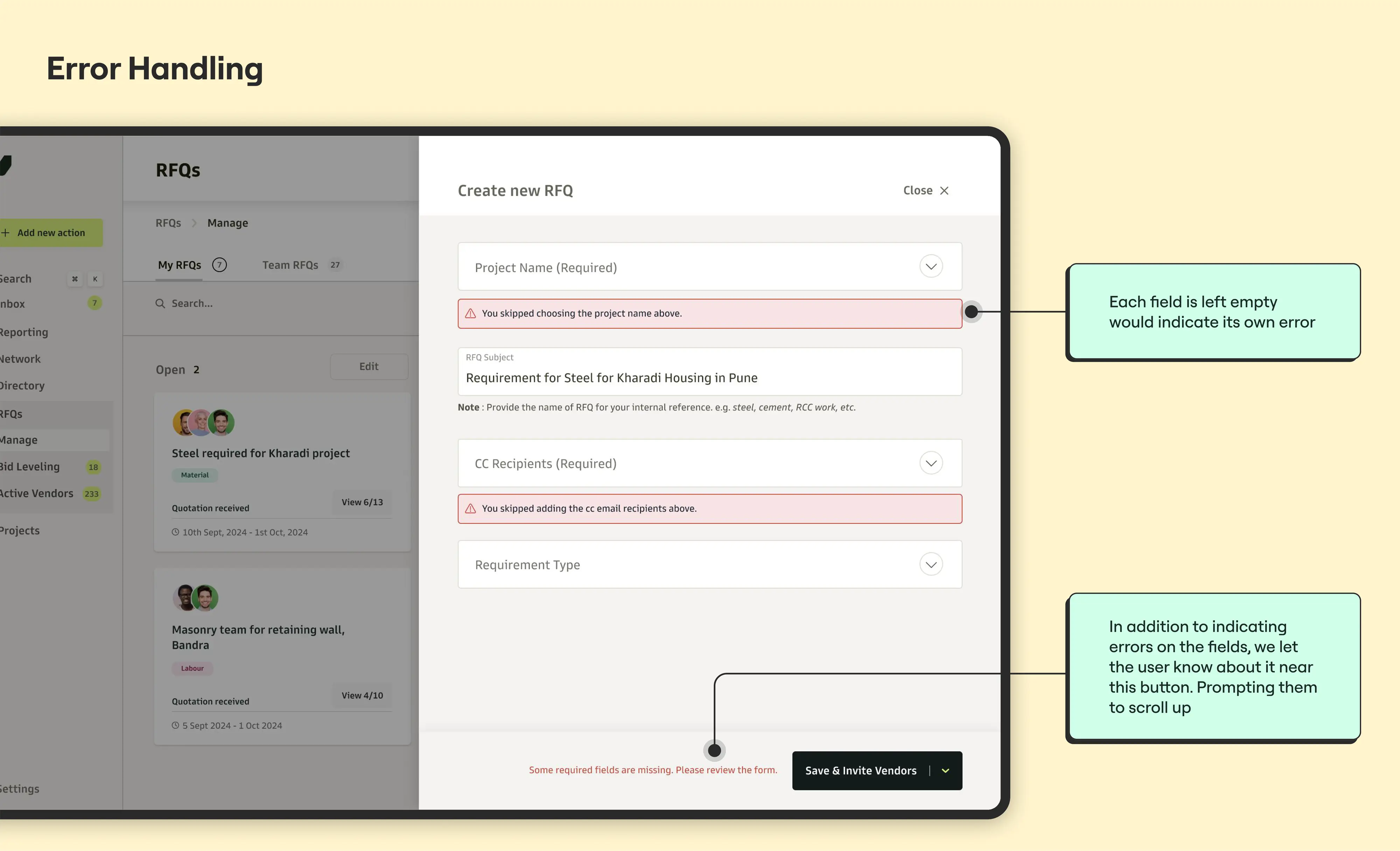
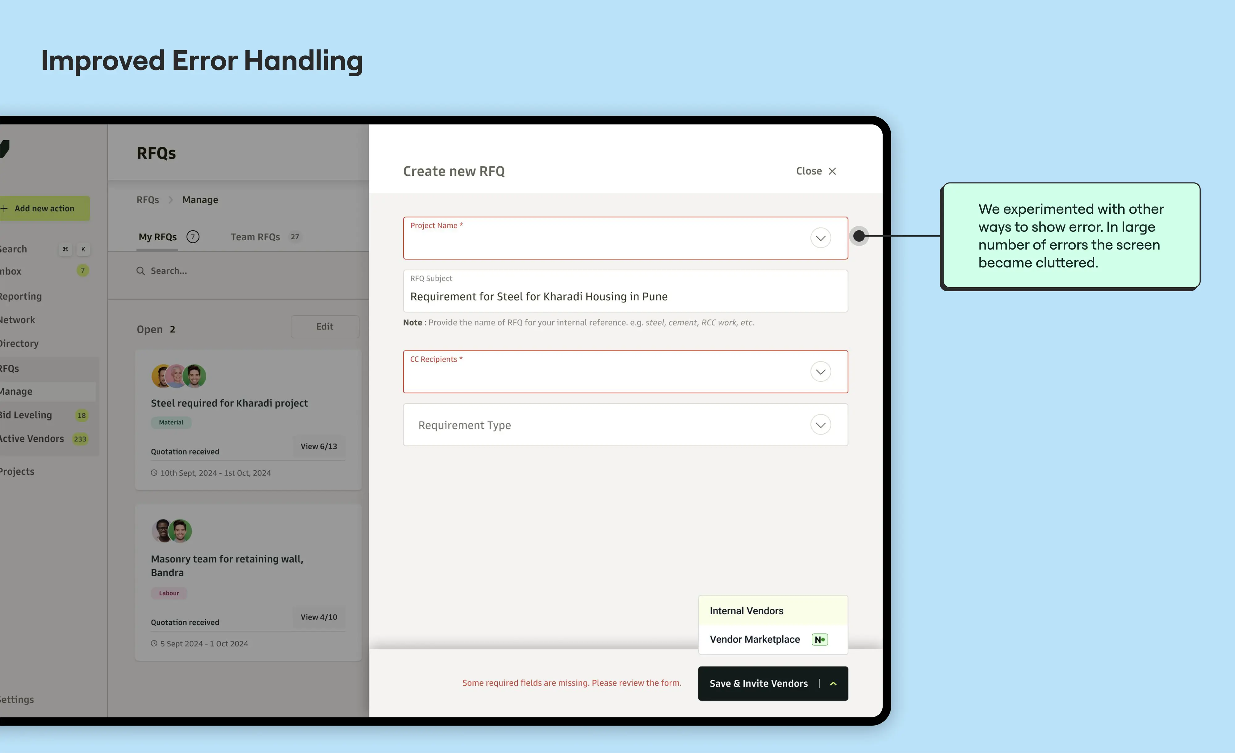
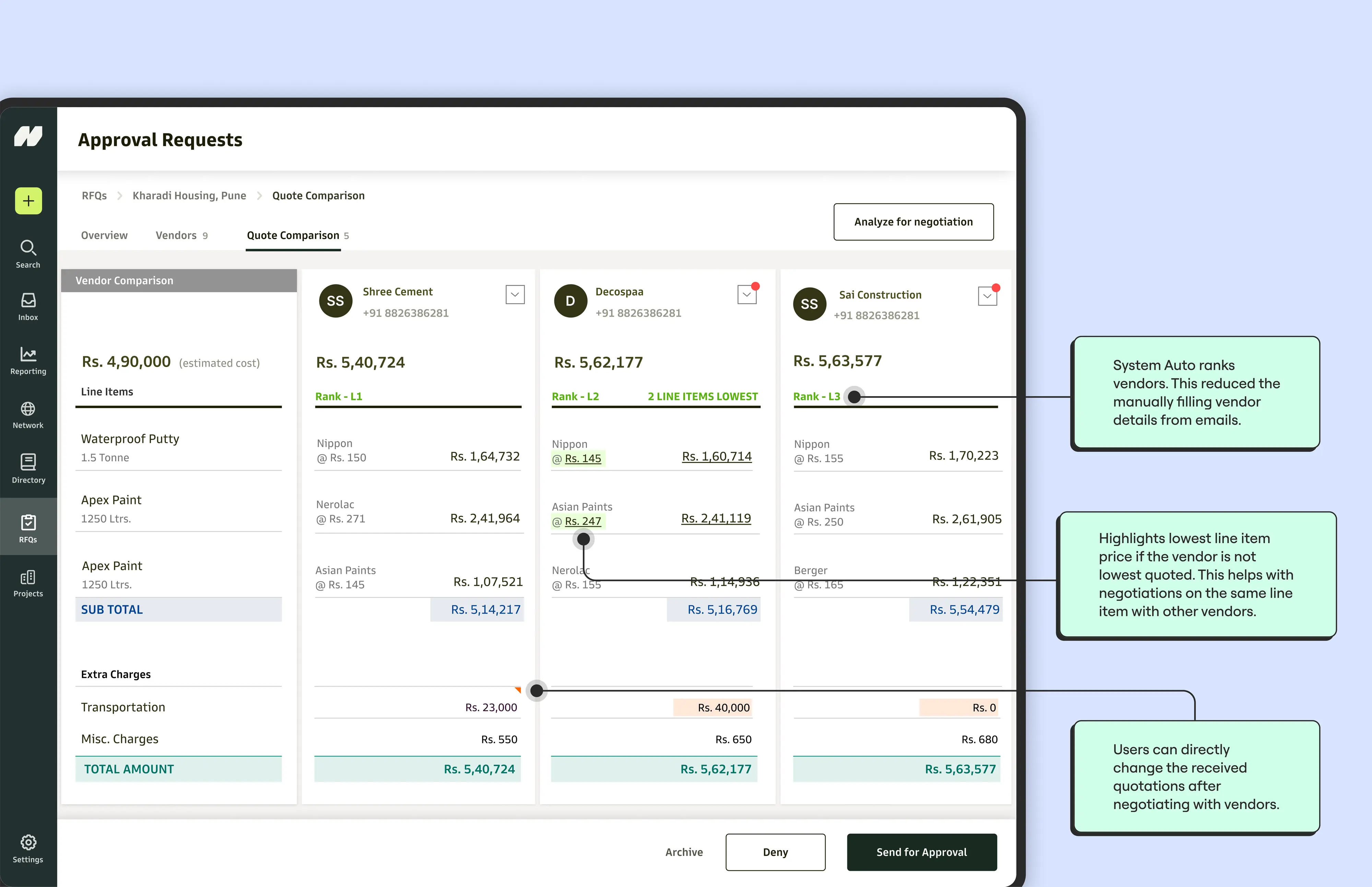
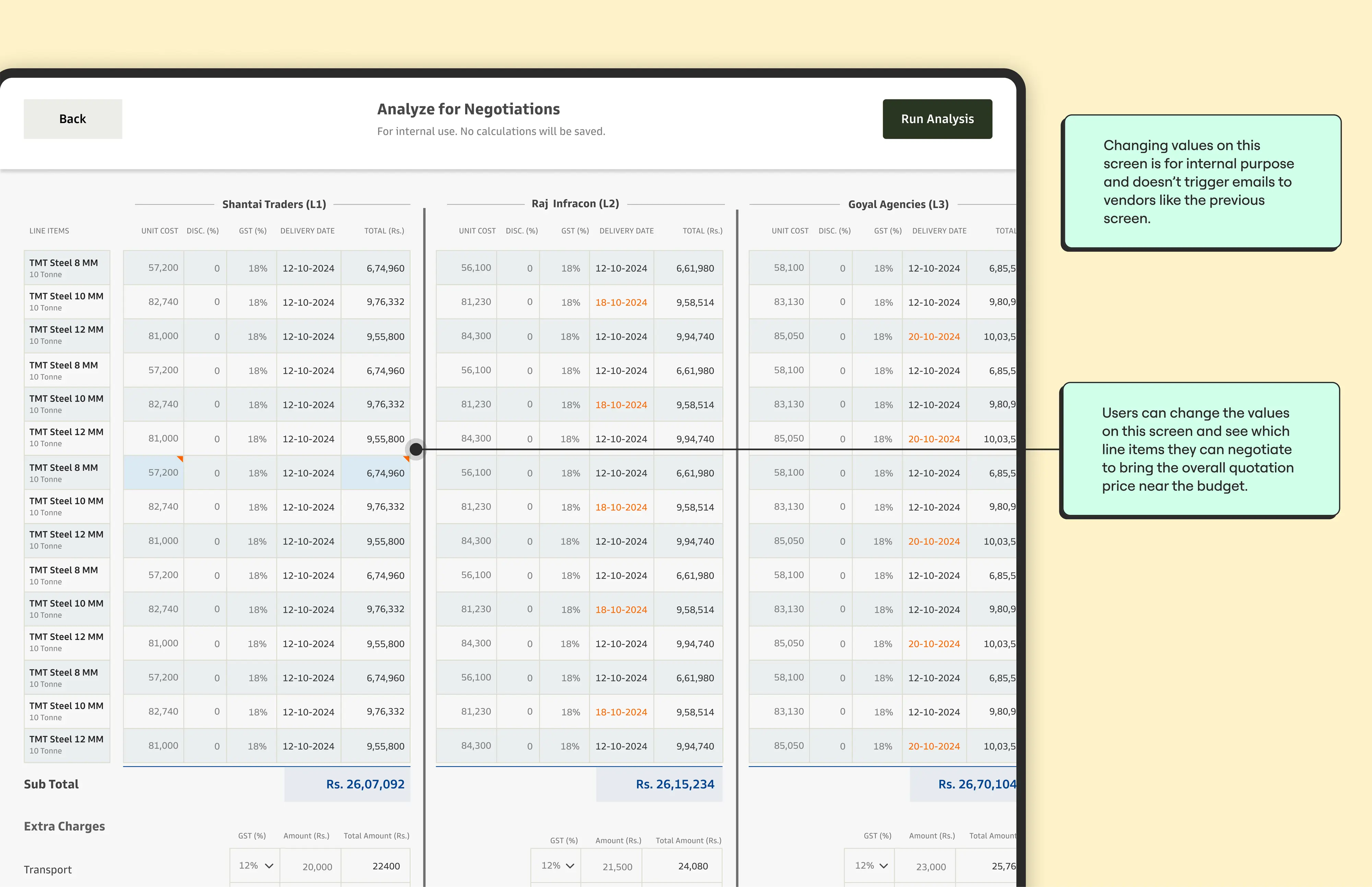
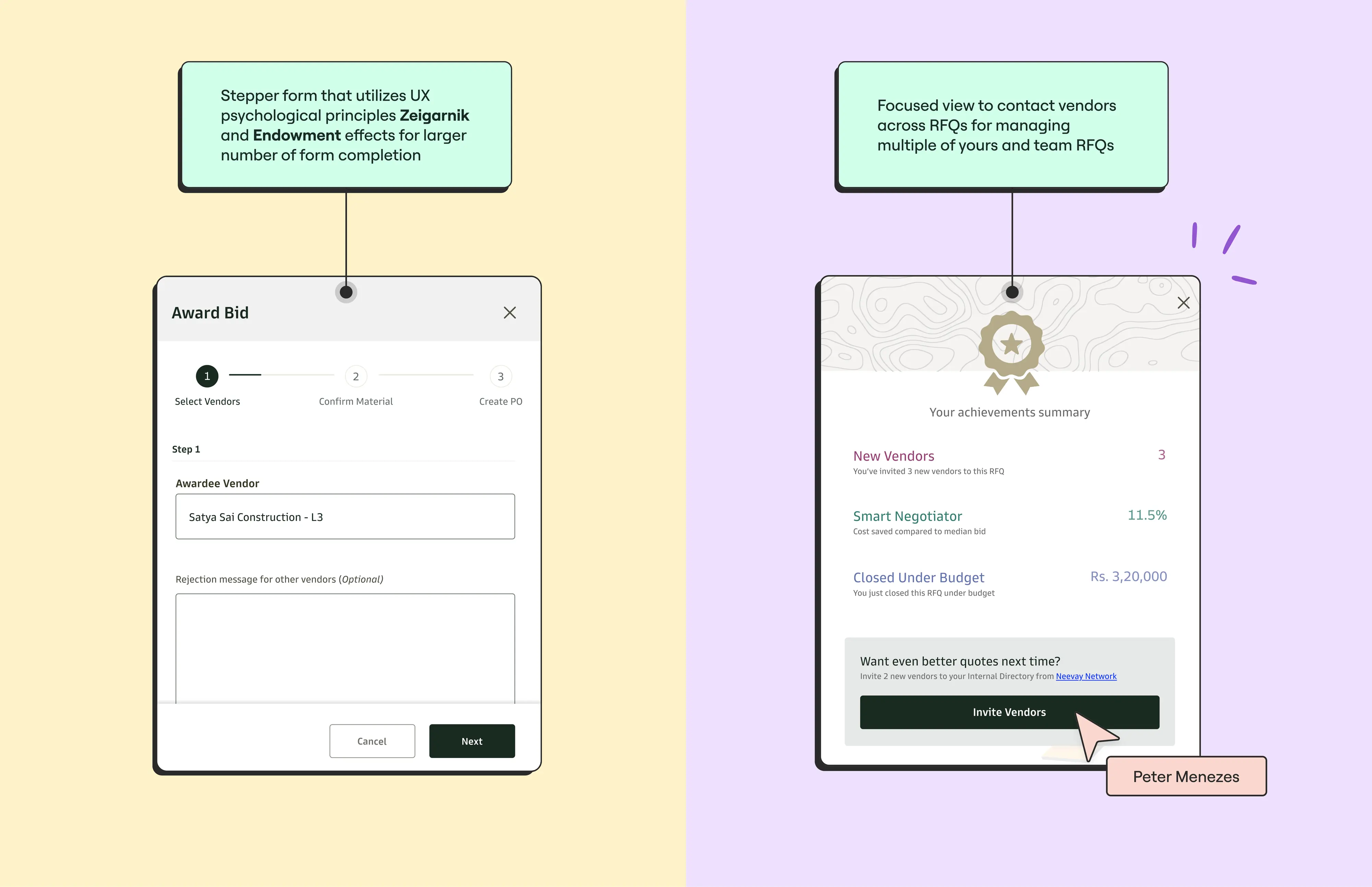
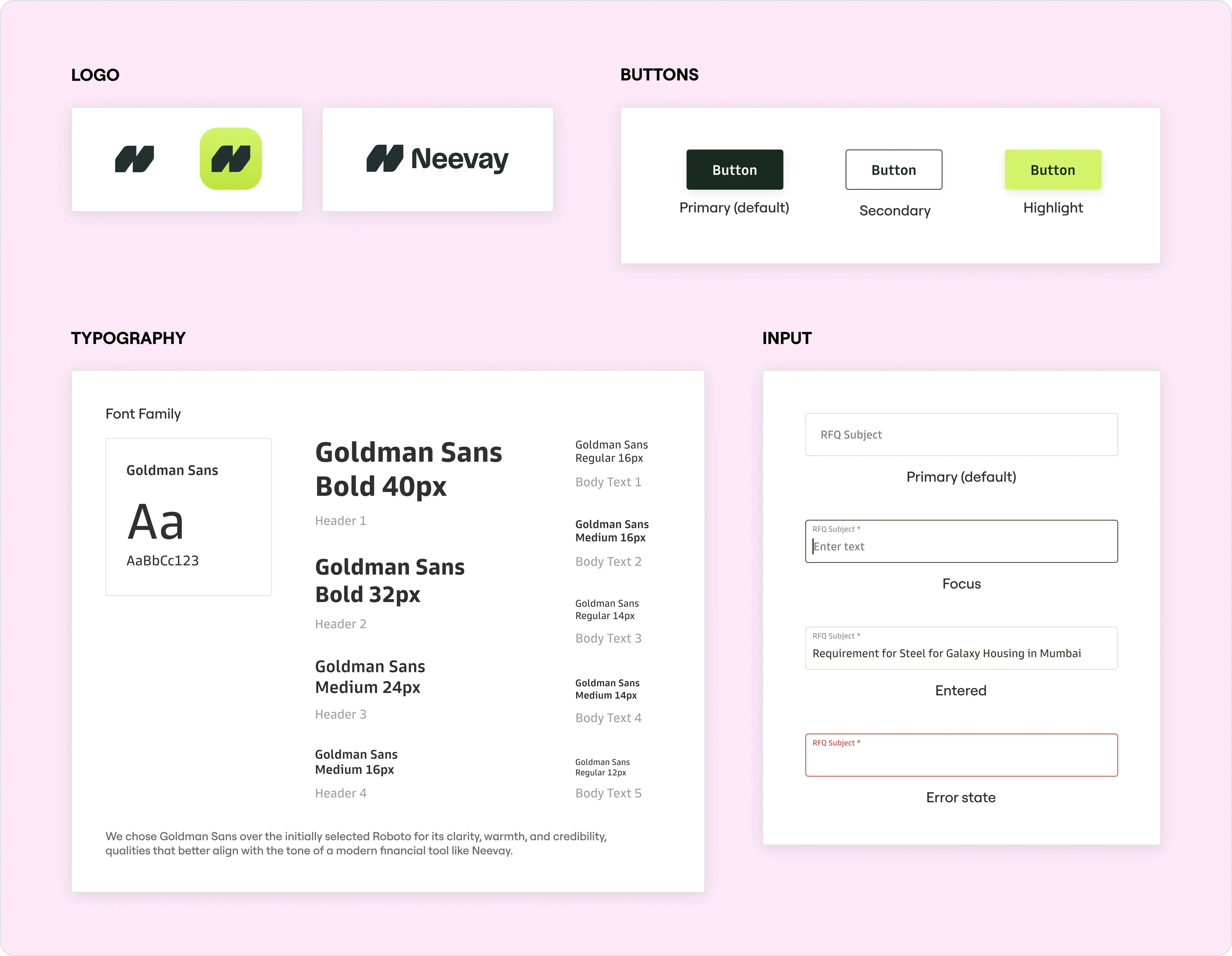
We removed unnecessary rigidity, introduced visual hierarchy, and made inputs feel natural and flexible. Material lists were redesigned as structured line items—making downstream bid leveling dramatically easier.
This wasn’t just UI polish. It was about shifting the product from “something they had to use” to “something that actually helped them work better.”