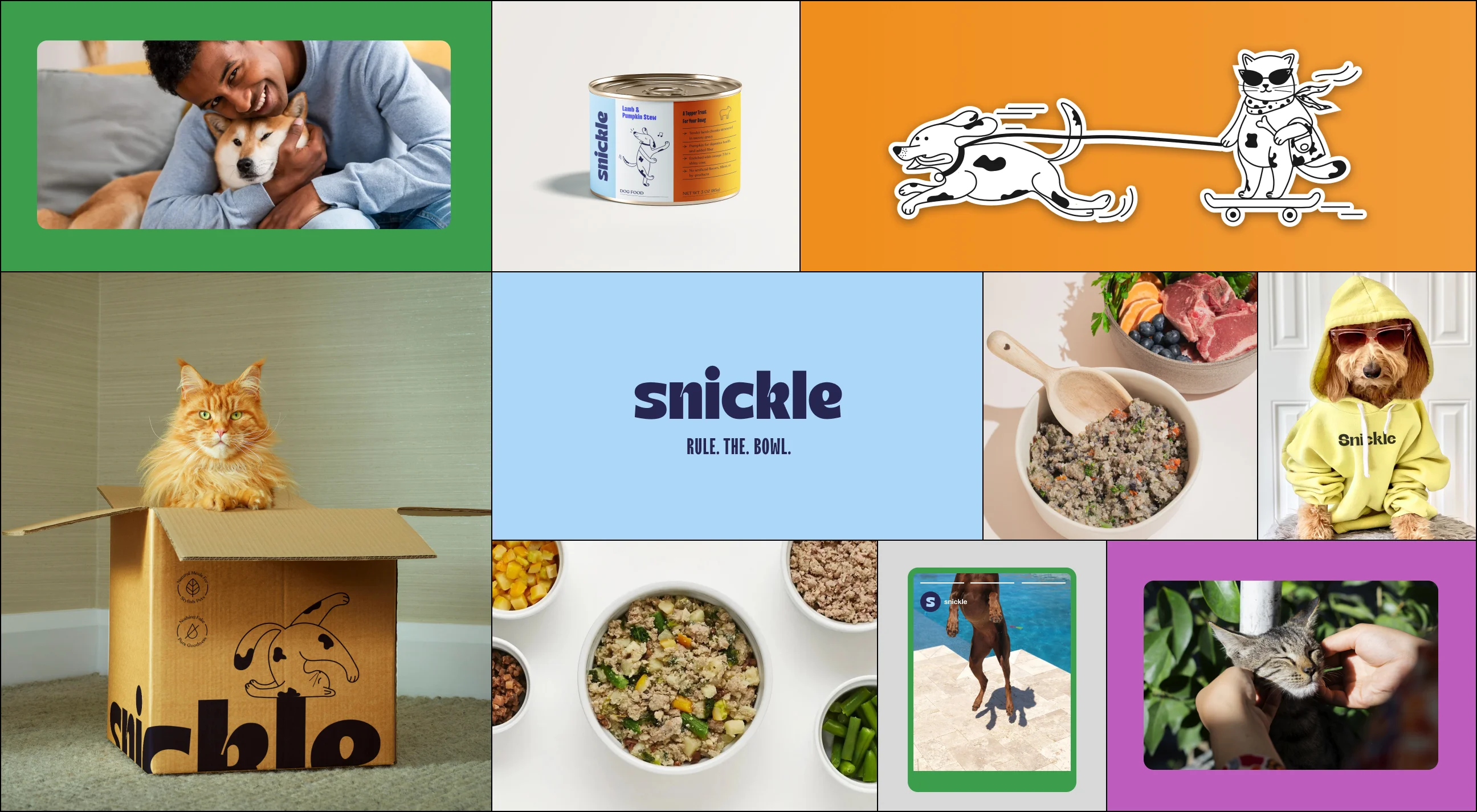
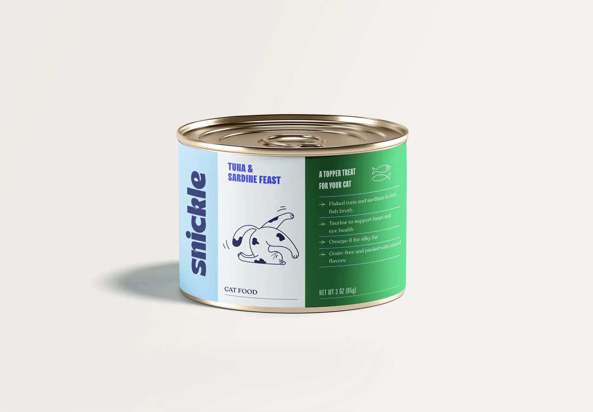
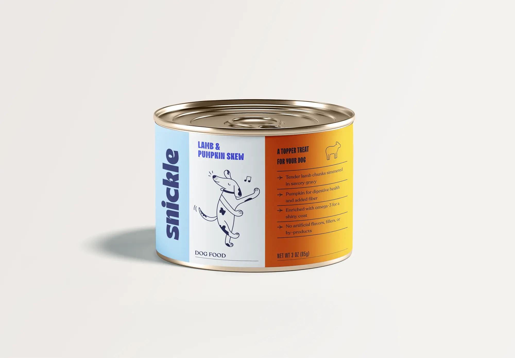
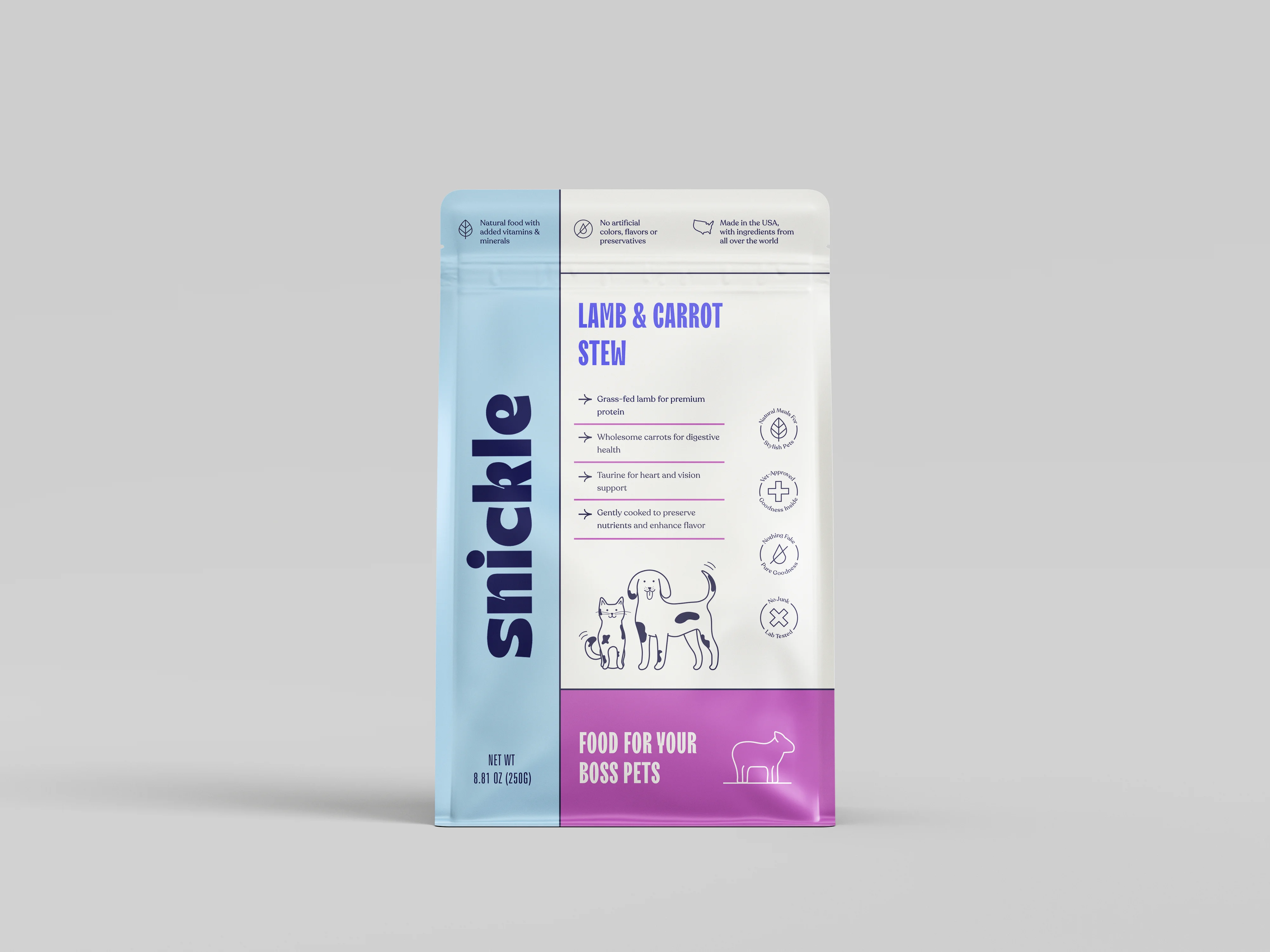
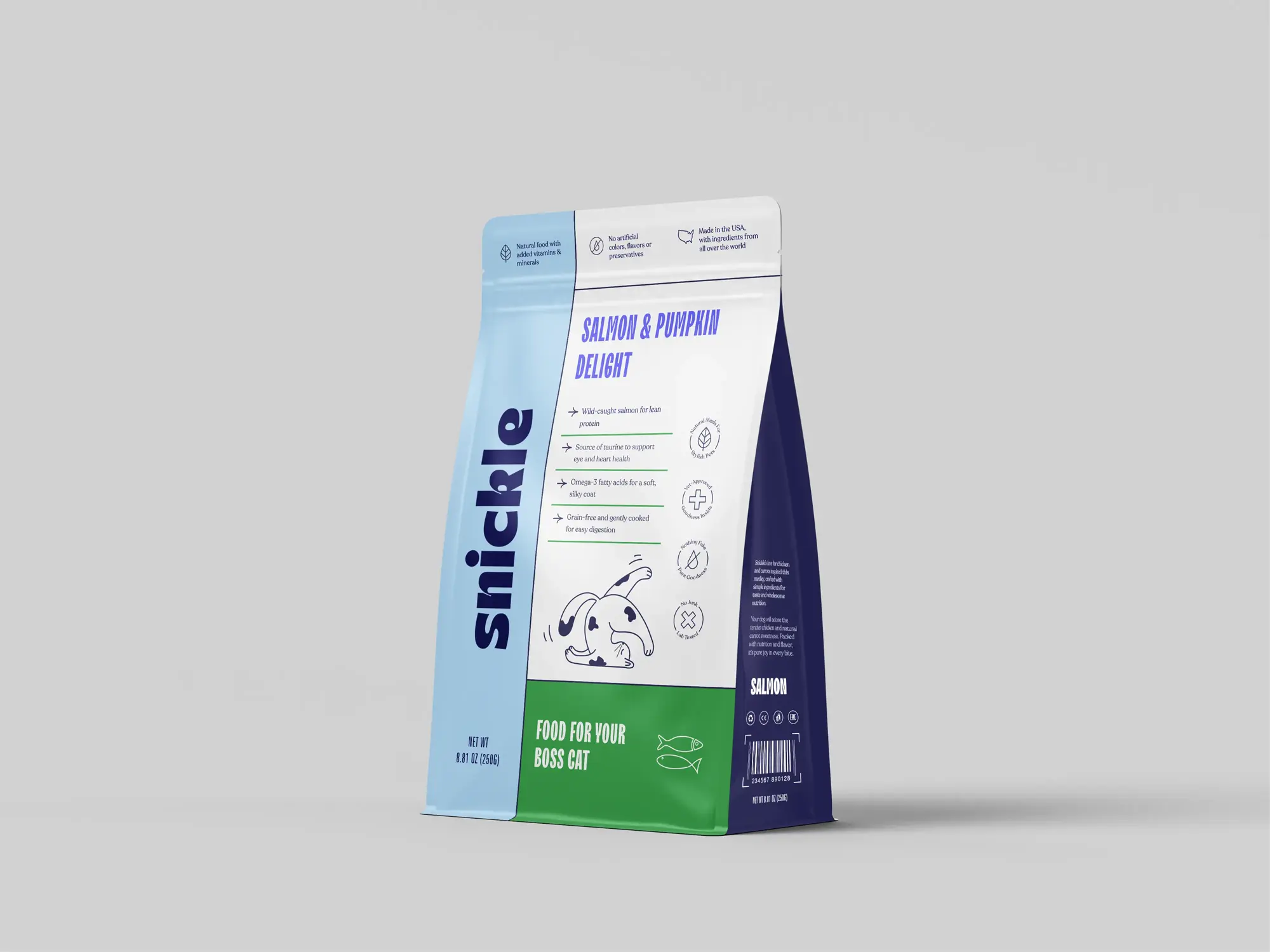
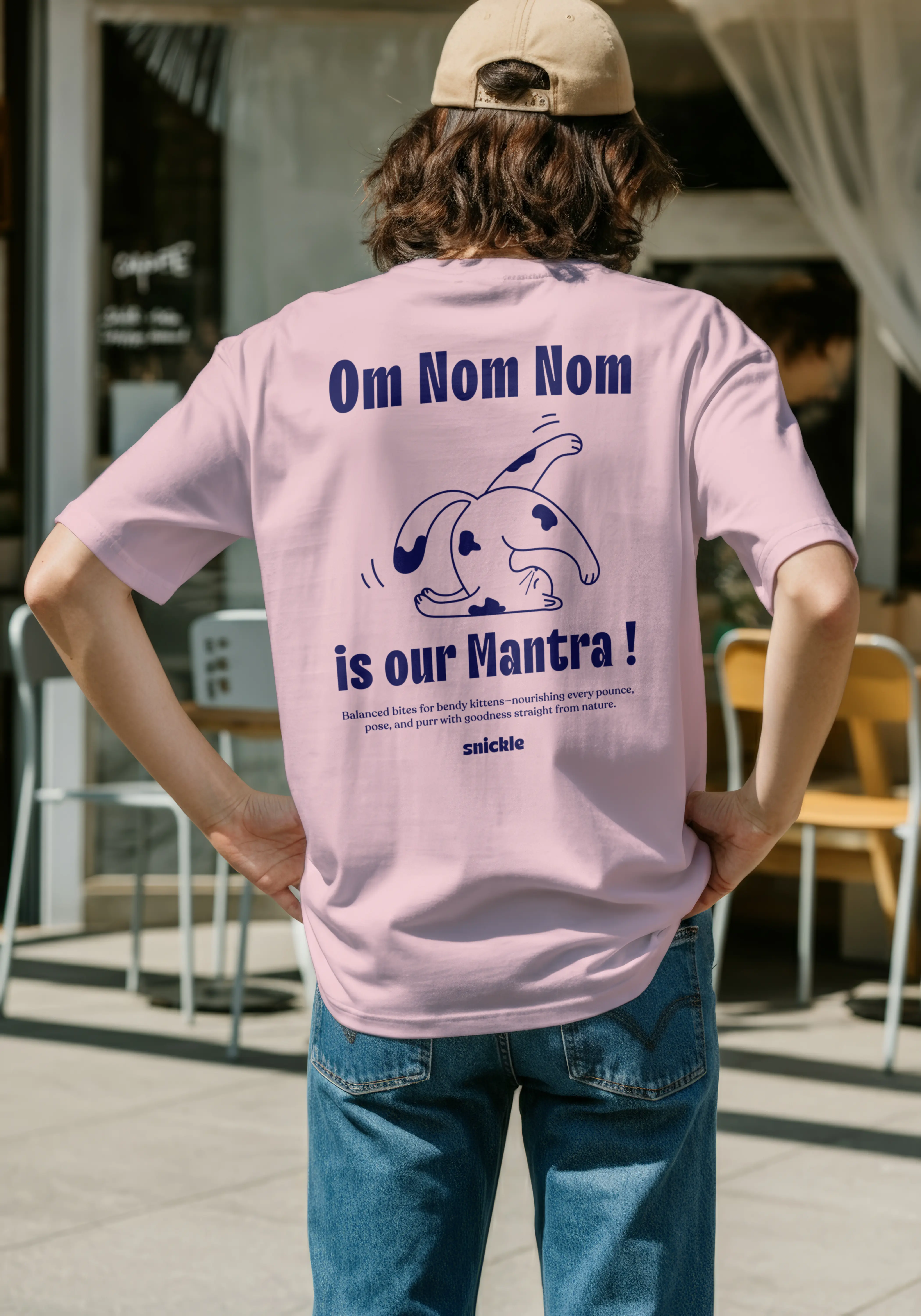
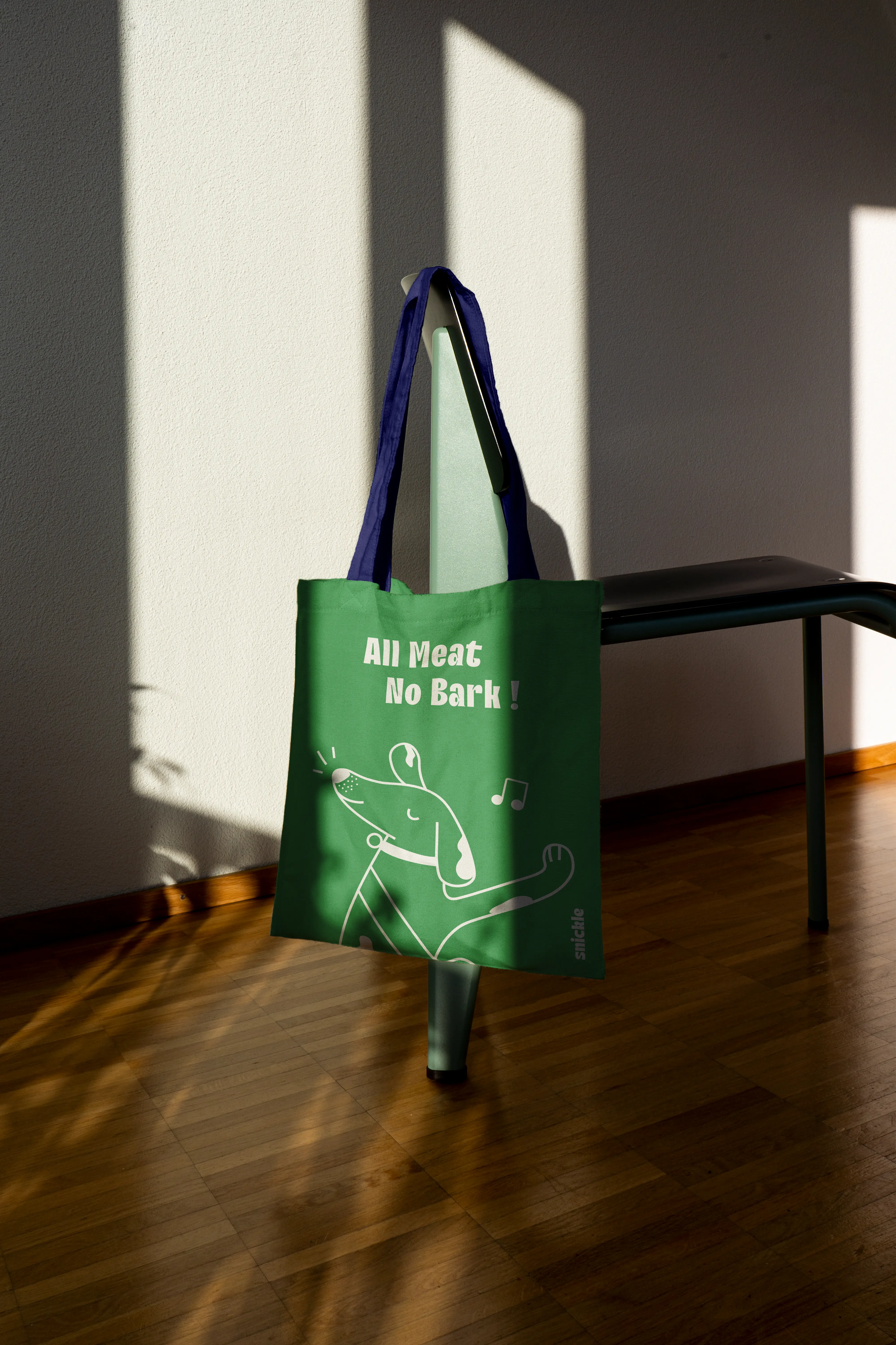
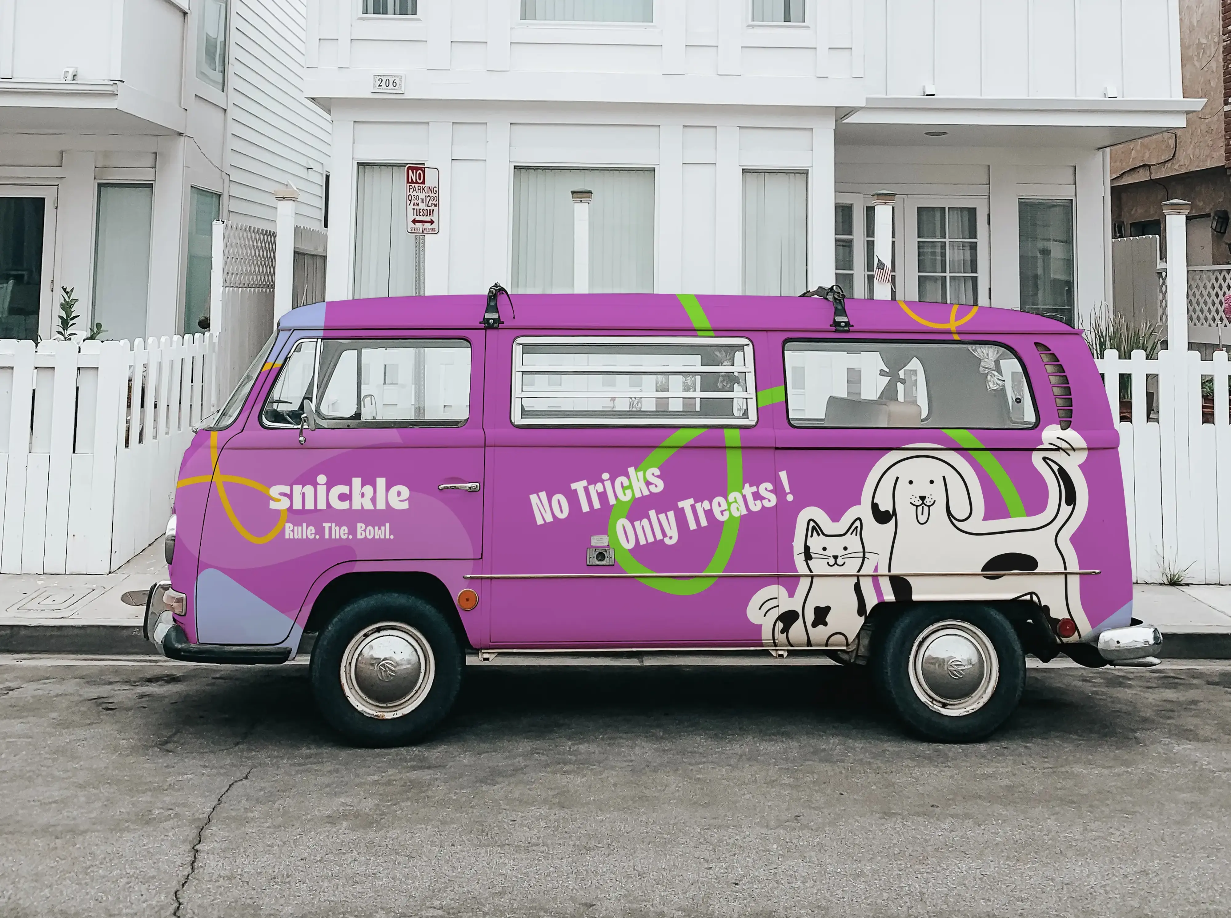
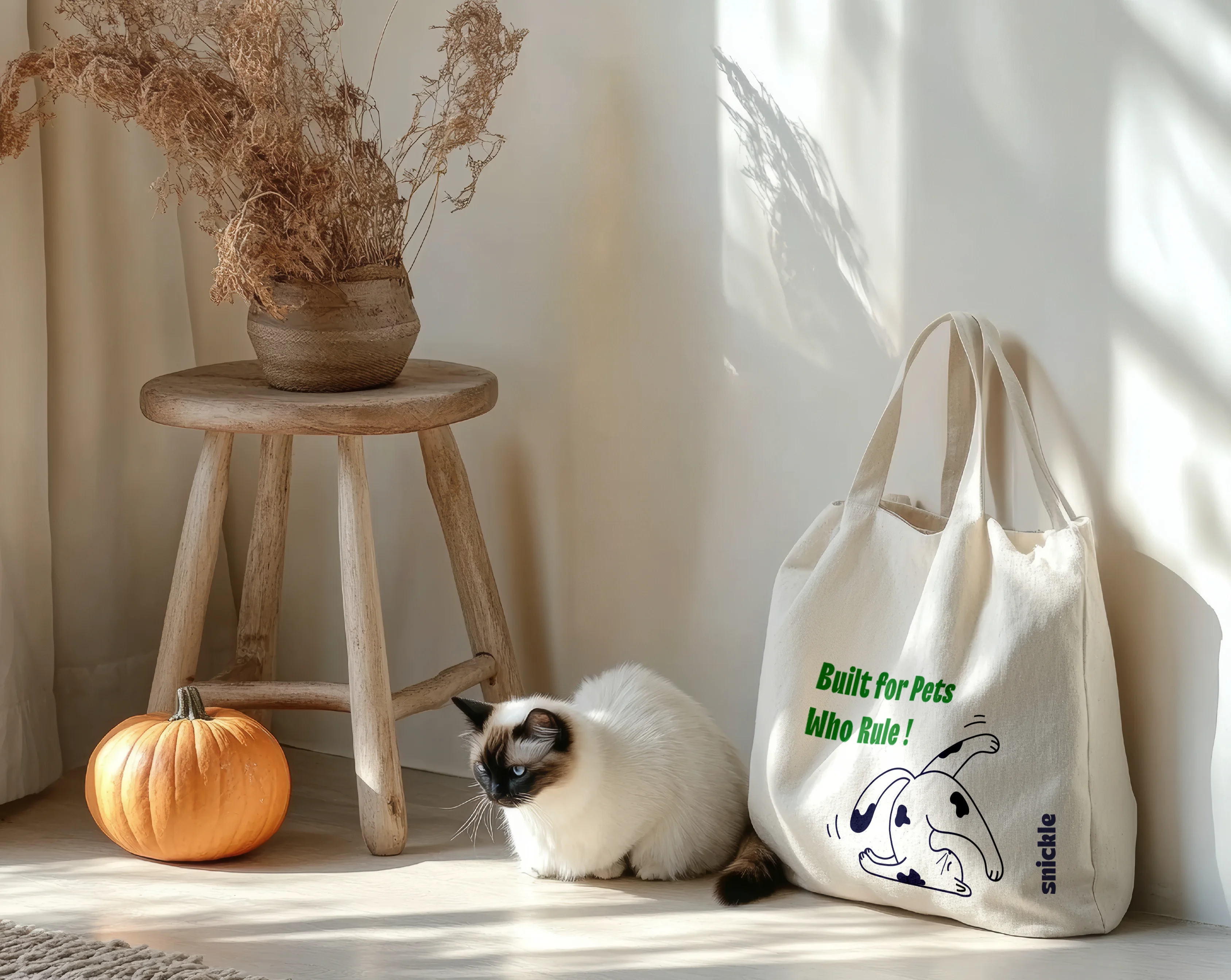
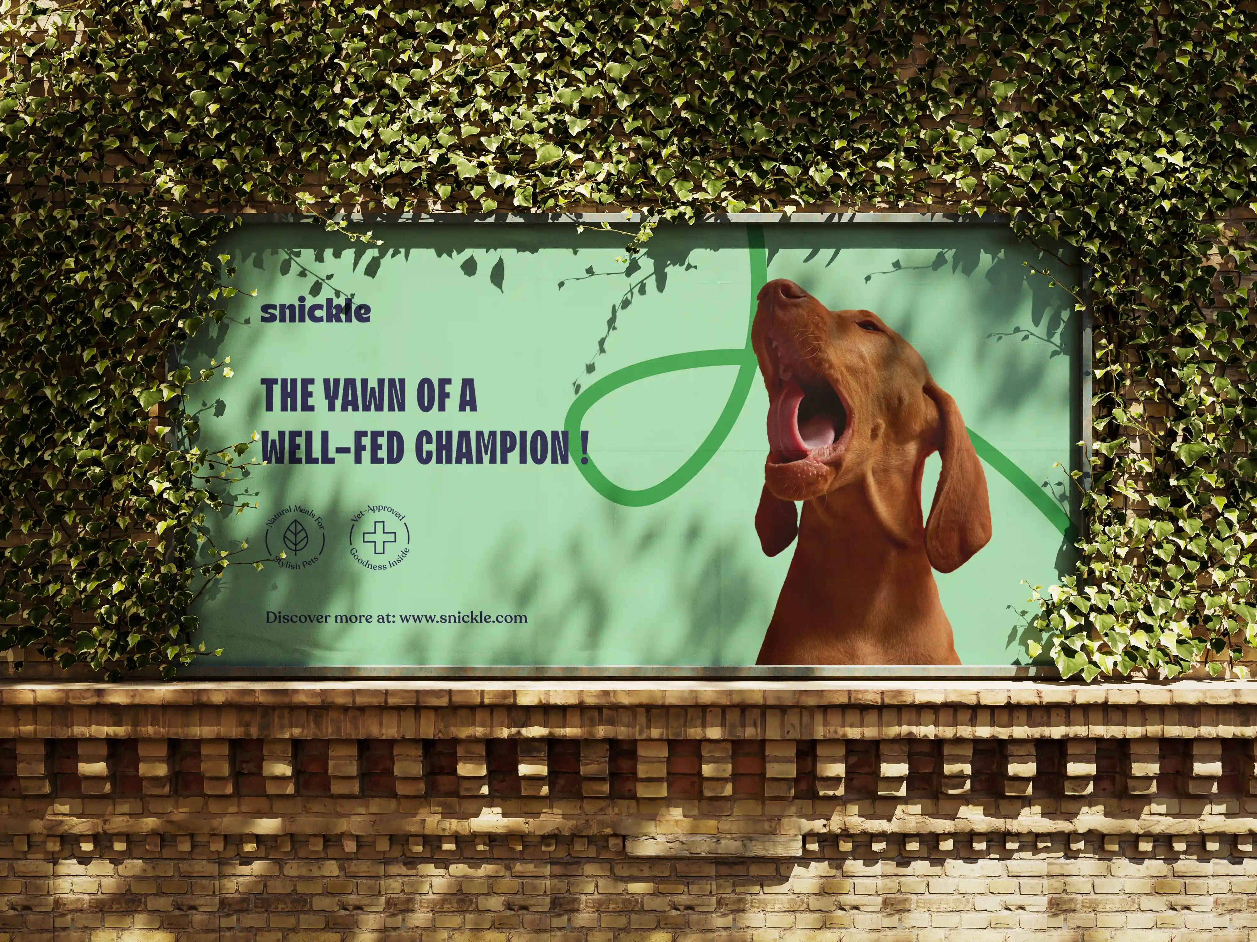
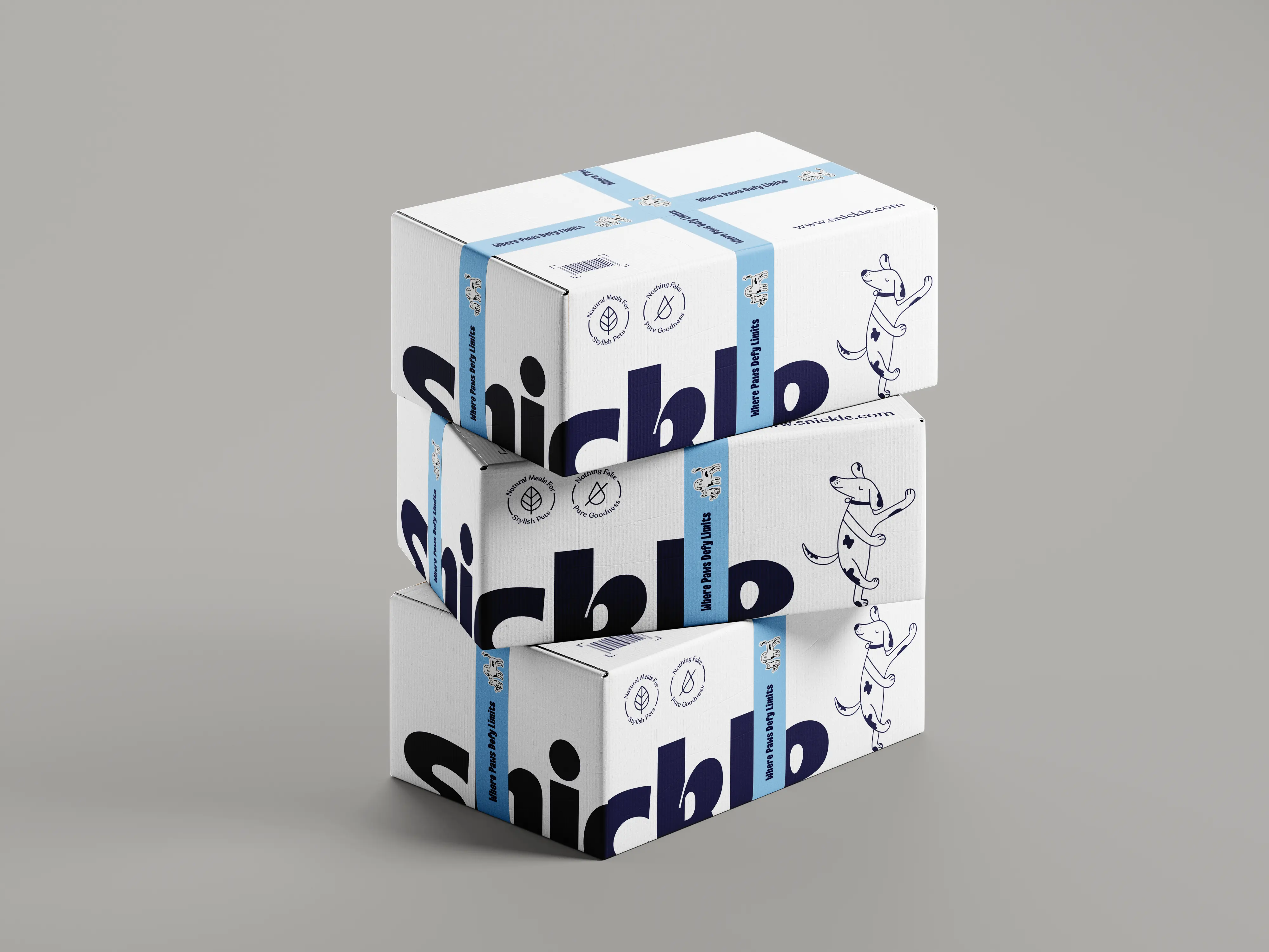
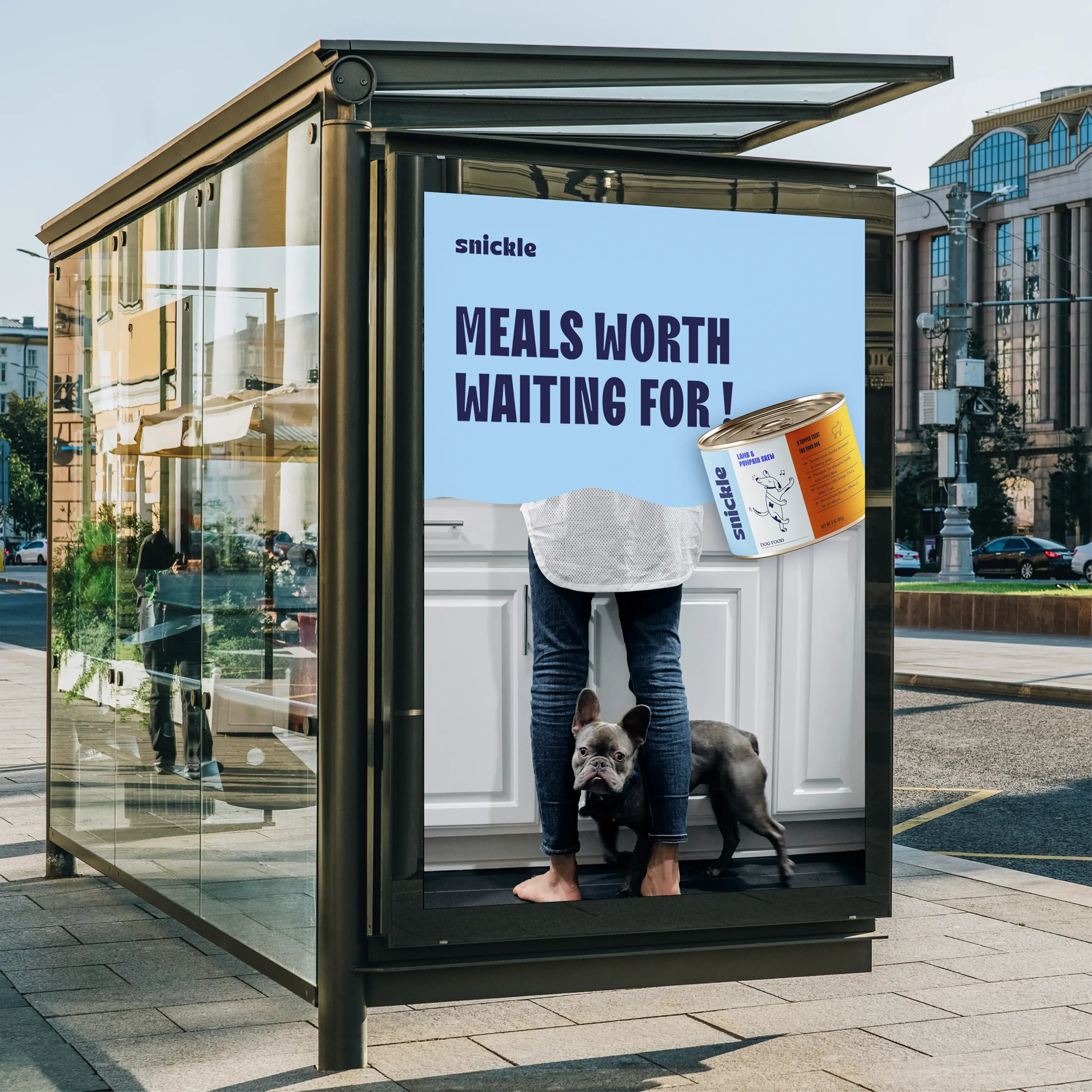
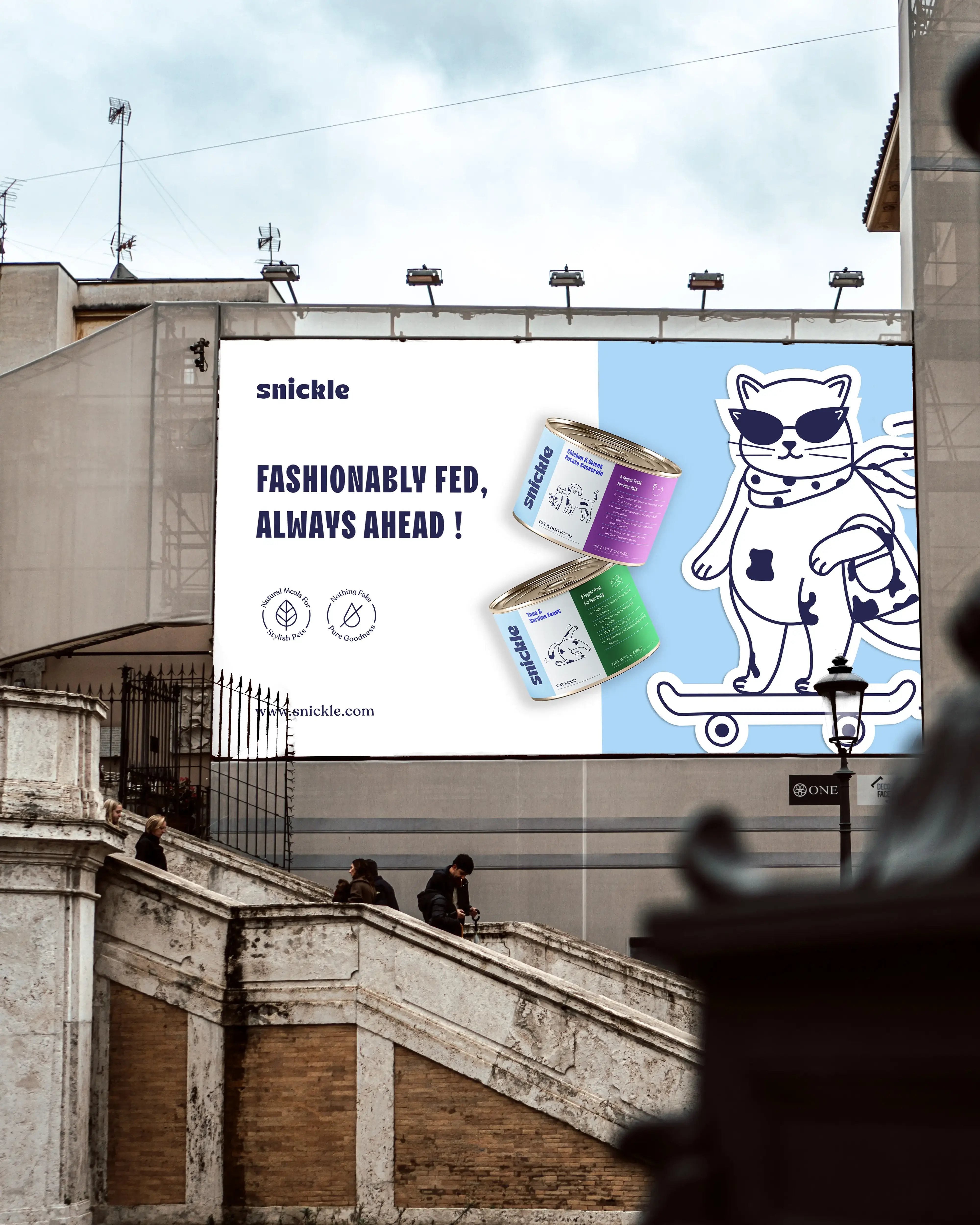
Snickle began as a self-initiated project—our team’s entry point into the world of branding. We wanted to build a fictitious brand that pushed us to think deeper about personality, tone, and storytelling. So we dreamed up Snickle, a pet food brand that doesn’t just fill bowls, but celebrates the wildly expressive lives of the pets who run the show.
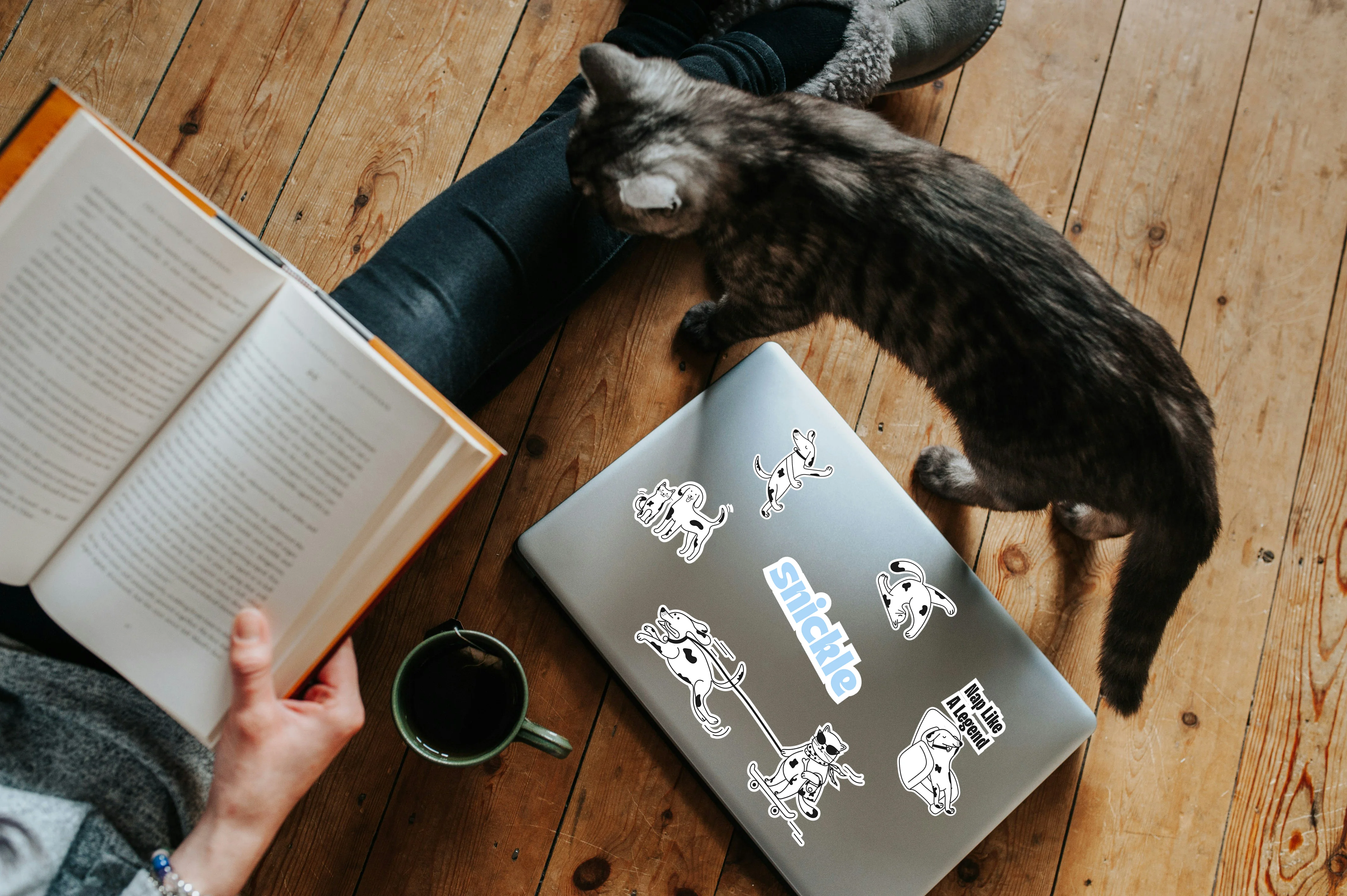
Most pet food brands are either overly cutesy or too clinical. But Snickle pets? They’re anything but basic. They’re couch yogis, skateboard champs, kitchen supervisors, and nap connoisseurs. Our challenge was to create a brand that captured their chaos, charm, and charisma—while still grounding it in the seriousness of good nutrition. It had to be fun, but never fluffy.